Typography is a powerful part of the Mizzou brand, transforming our message into something visually impactful. From recruiting prospective students to engaging with alumni, these versatile brand fonts create compelling, audience-specific communications that embody the Mizzou brand.
Before using the brand fonts, familiarize yourself with these guidelines and best practices. If you have questions about typography or using the fonts for your audience, please contact brand@missouri.edu.
Font Sets
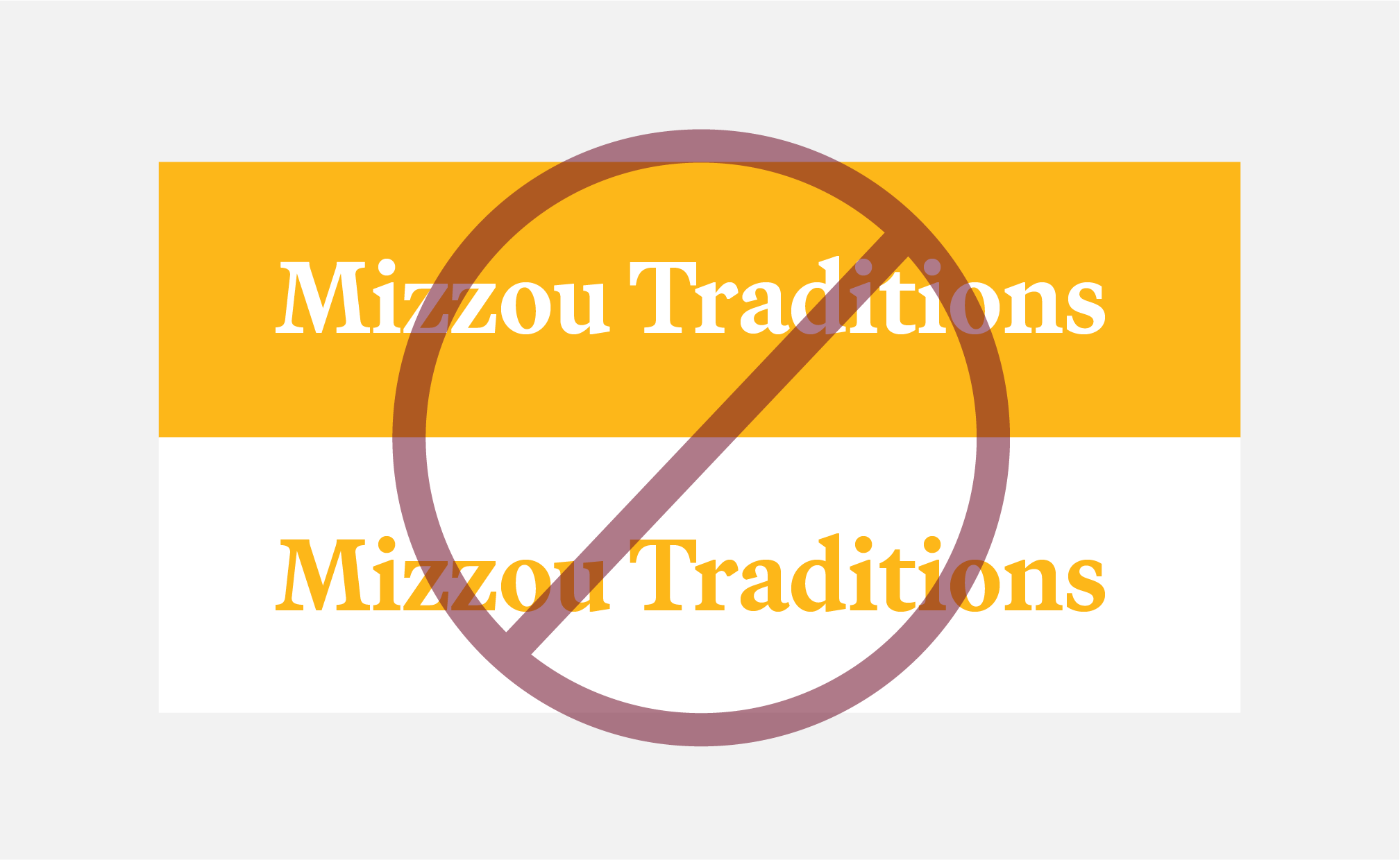
Consistency is key! It’s important to use brand fonts when communicating with our internal and external audiences.
- When using brand font sets B or C, follow all the guidelines and best practices for font set A.
- Do not mix and match fonts from different sets.
Font Set A
(Limited License)
Best for:
- Central MarCom, academic unit communicators and graphic designers.
These fonts require a license.
A limited number of licenses have been purchased for central MarCom staff, academic unit communicators and graphic designers responsible for high-level marketing materials.
To request these fonts, please fill out the brand font request form.
Freelance designers and vendors on contract with Mizzou are required to purchase their own license of the current brand fonts.
- Manuka
- Martina Plantijn
- ABC Social
- Gotham
- Beverly Drive Right*
- Canora Frente
- Dynalight
Font Set B
(Adobe License)
Best for:
- Faculty and staff with an Adobe CC or Adobe Express license.
These fonts are available with an Adobe CC license or Adobe Express license through DoIT.
If you have questions or need help activating the fonts in an Adobe program or Adobe Express, please email brand@missouri.edu.
- Rama Gothic M
- Guyot Text
- Balto
- Gotham
- Beverly Drive Right
- Canora Frente
Font Set C
(Free)
Best for:
- Faculty and staff without an Adobe CC or Adobe Express license.
- PowerPoint presentations and templates.
These fonts do not require a license and have been installed on all university-owned devices by DoIT.
Research areas and research labs may need additional permissions for installing these fonts. If you are unable to find the fonts on a university-owned device, please email brand@missouri.edu.
- Morganite
- STIX Two Text
- Satoshi
- Montserrat
- Dynalight
Jump To
Key Typography Terms | Brand Fonts & Guidelines | Font Pairings by Audience | Signature and Evergreen Fonts | Web Fonts
Key Typography Terms
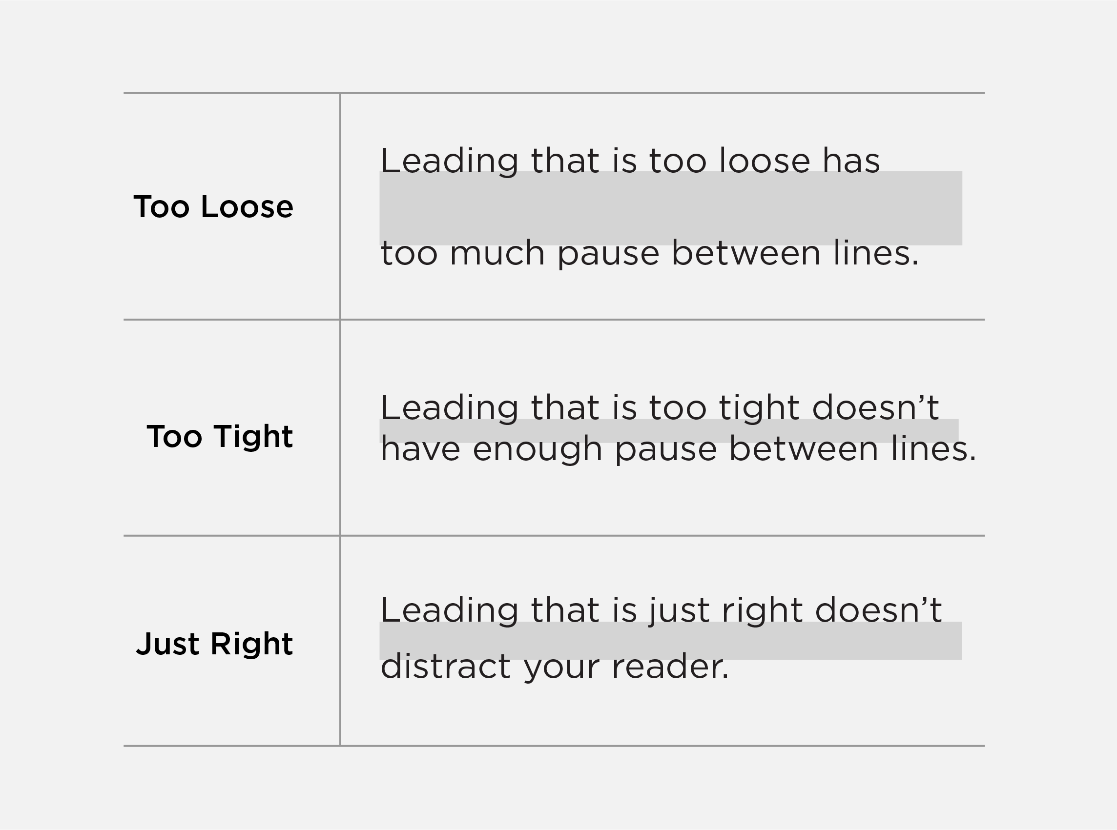
Leading
The space between lines is called leading and is a critical part of making type look professional and easy to read. Refer to each brand font for leading guidance.
Tracking
Tracking refers to the space between all letters in a word. Adjusting tracking is usually done to fill a space or make a word appear more airy or important.
Only adjust tracking if it is specifically mentioned in the brand font guidelines and best practices. For an example of tracking, view the high-level events and celebration examples.
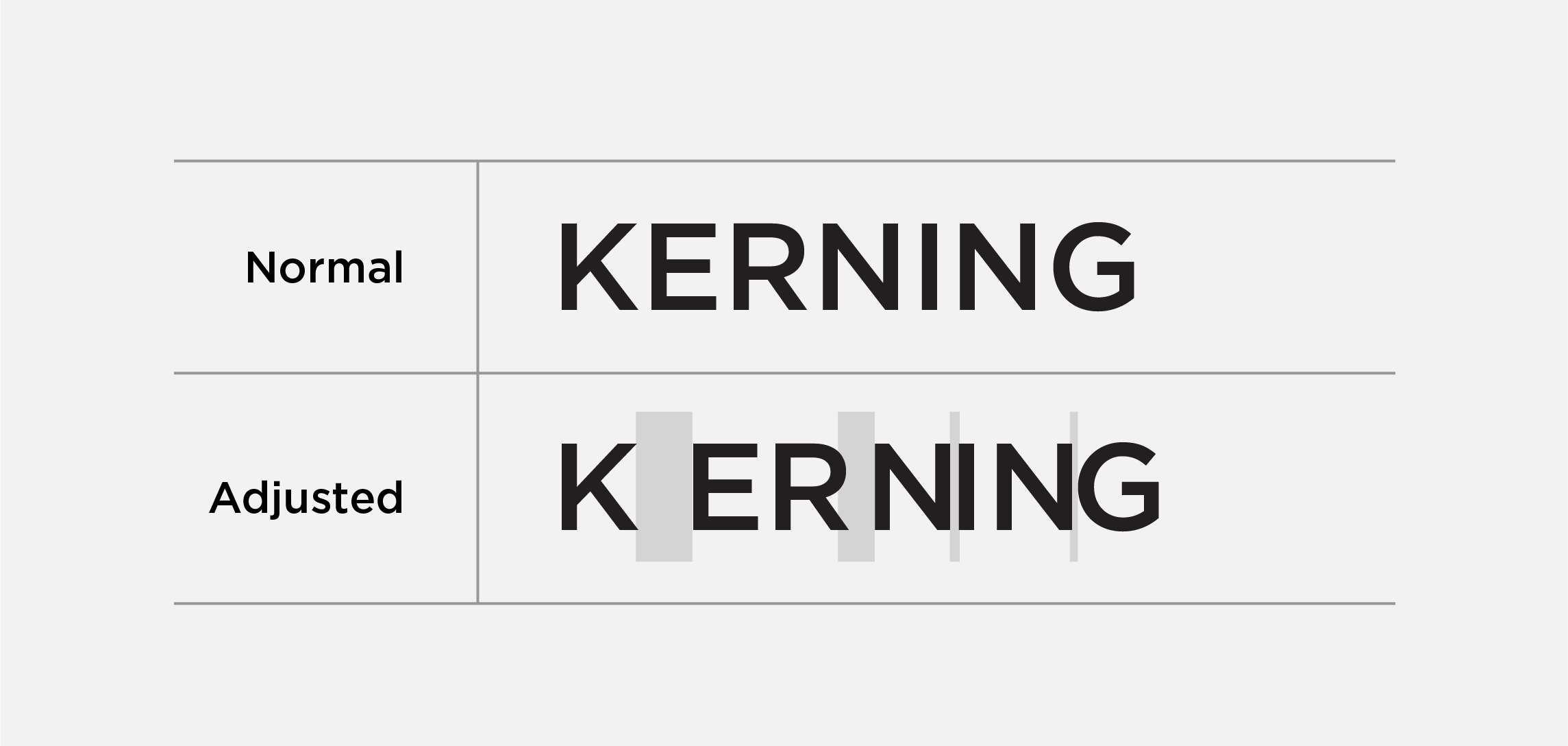
Kerning
Kerning refers to the space between two letters. Adjusting kerning is often done to help with readability of a word at specific font sizes. Only adjust kerning if you are a professional designer.
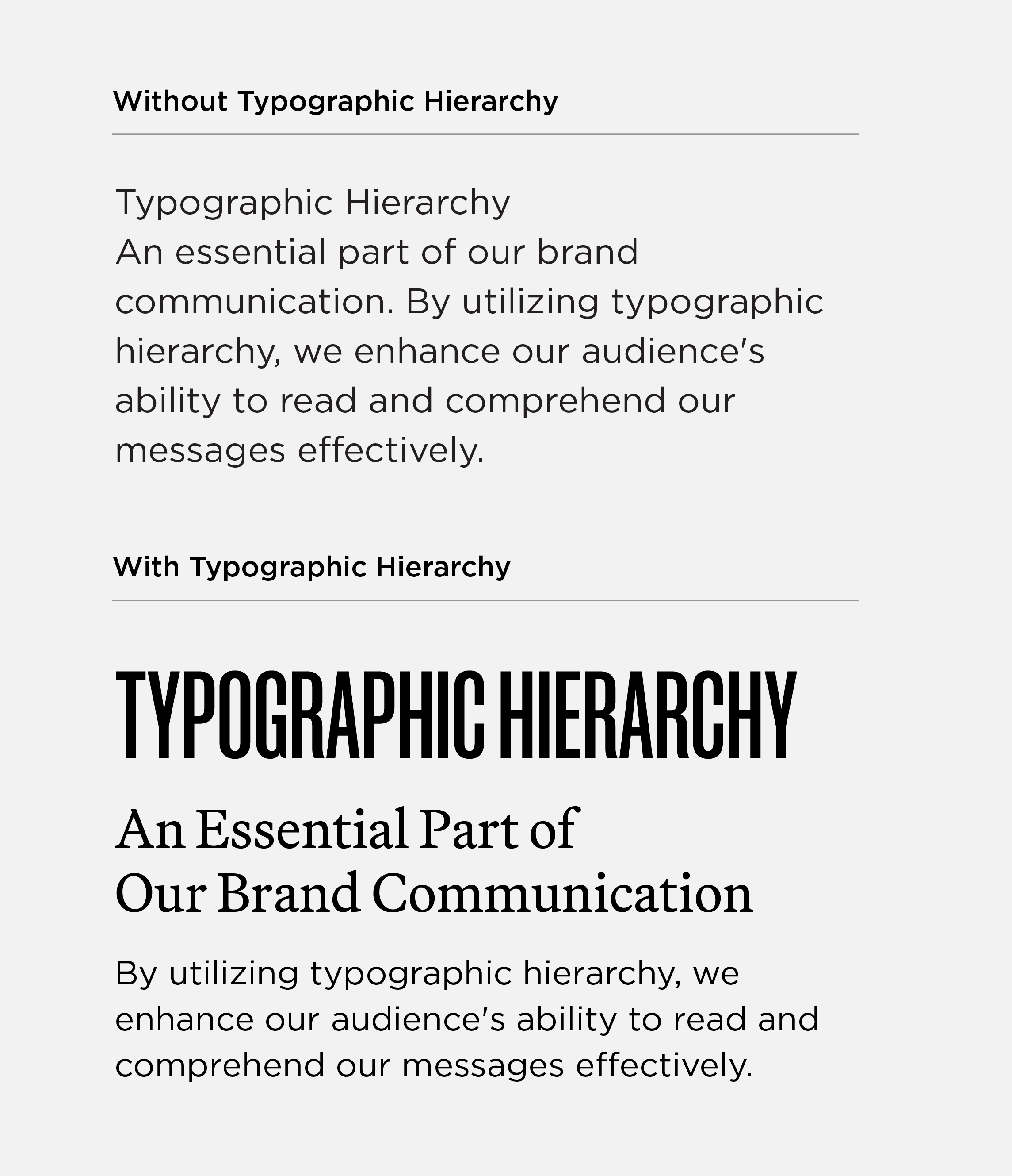
Typographic Hierarchy
Typographic hierarchy is how the reader knows which information to focus on first and what to focus on next by using distinct headlines, subheads and body text. This allows the eye to flow from the most important information to the supporting points and beyond.
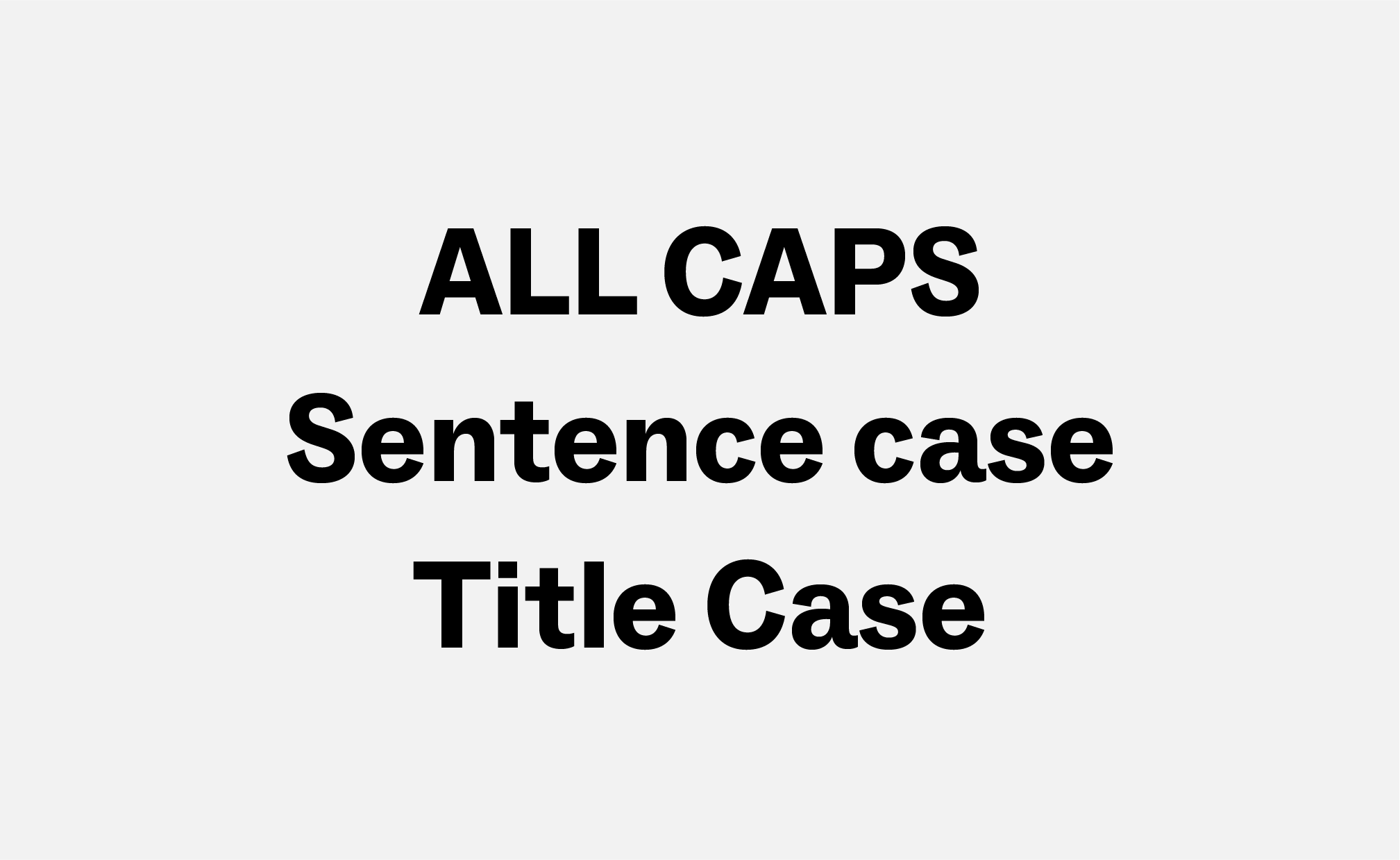
Hierarchy is achieved by using multiple typefaces, cases (upper/lower/sentence/title), font sizes, font weights, and the position and alignment of information.
Refer to the brand font guidelines, best practices and audience examples for additional examples and guidance on typographic hierarchy.
Brand Fonts & Guidelines
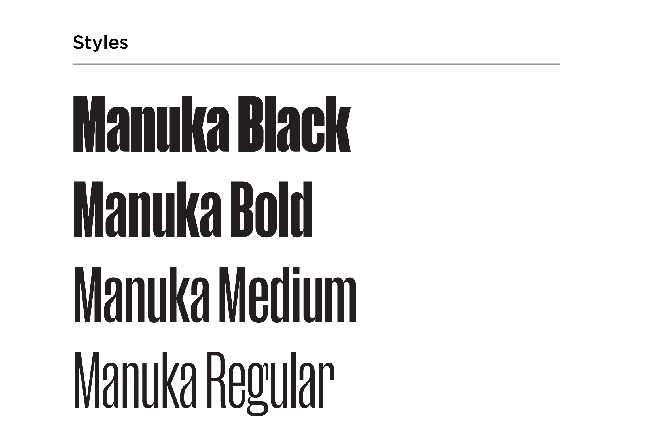
Manuka
Manuka is a condensed sans serif. While there is a whole family of font styles for Manuka, the Mizzou brand only uses Manuka Black, Bold, Medium and Regular.
Approved alternates for Manuka:
- Font Set B: Rama Gothic M
- Font Set C: Morganite
Use Manuka for:
- Mastheads
- Headlines
- Statistics and numbers
Do not use Manuka for:
- Body copy
- Captions
- Contact information
(URLs, phone numbers, email addresses)
Manuka Guidelines & Best Practices
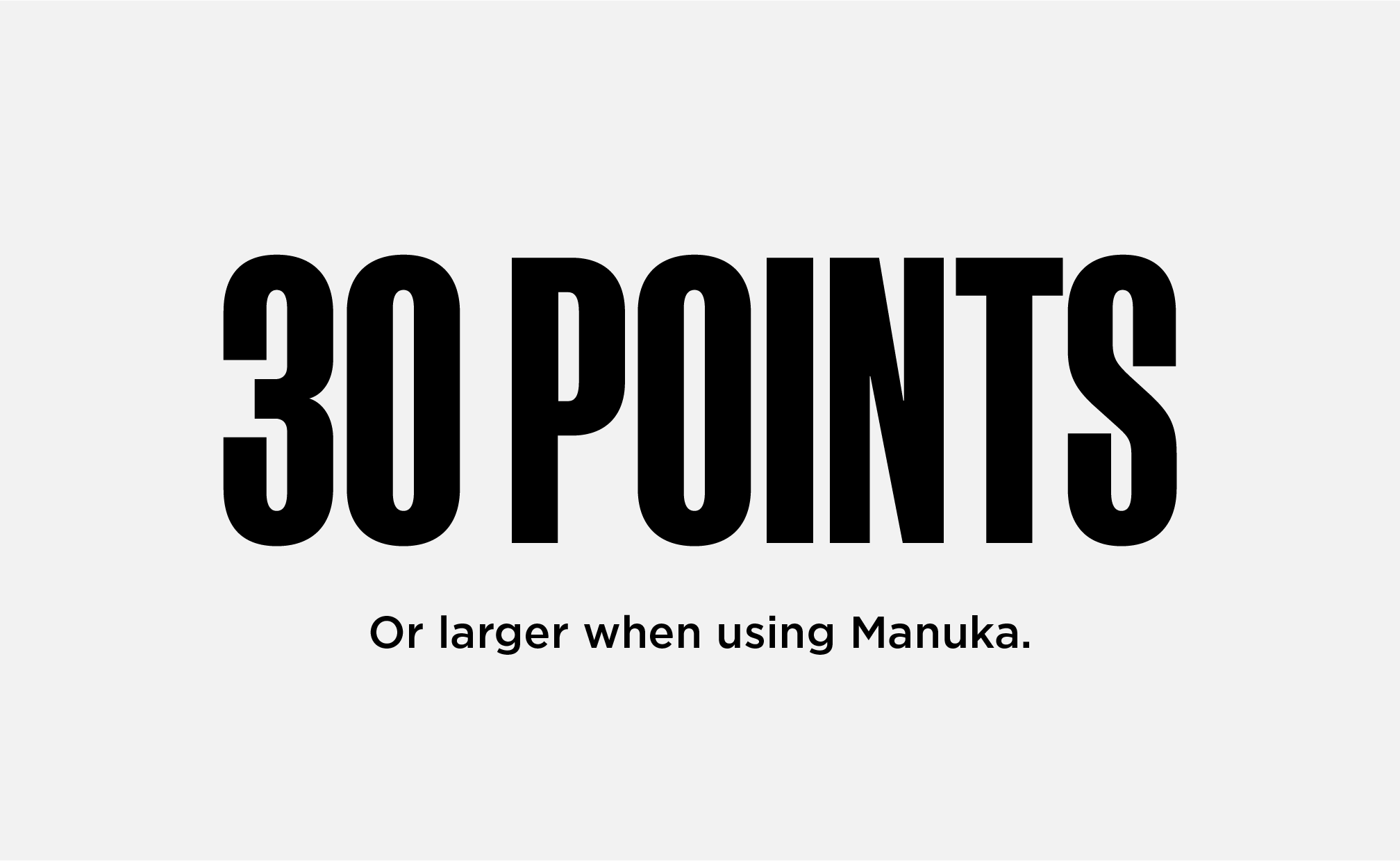
MINIMUM SIZE
Stay at or above 30 pt font size for legibility.
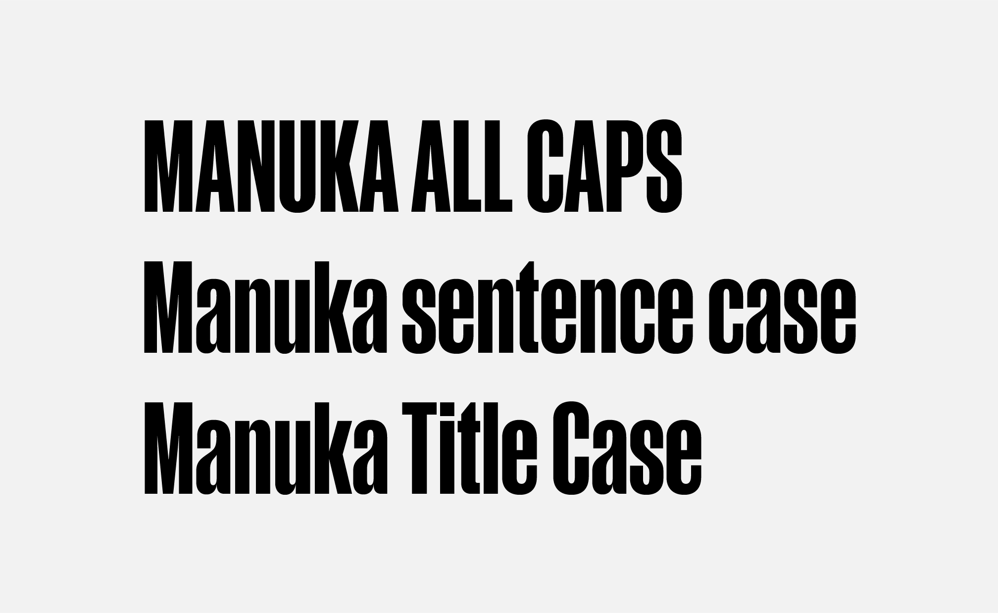
CASE
Manuka may be used in all caps, title case or sentence case.

LEADING
Manuka’s leading should always be equal to the space between words.
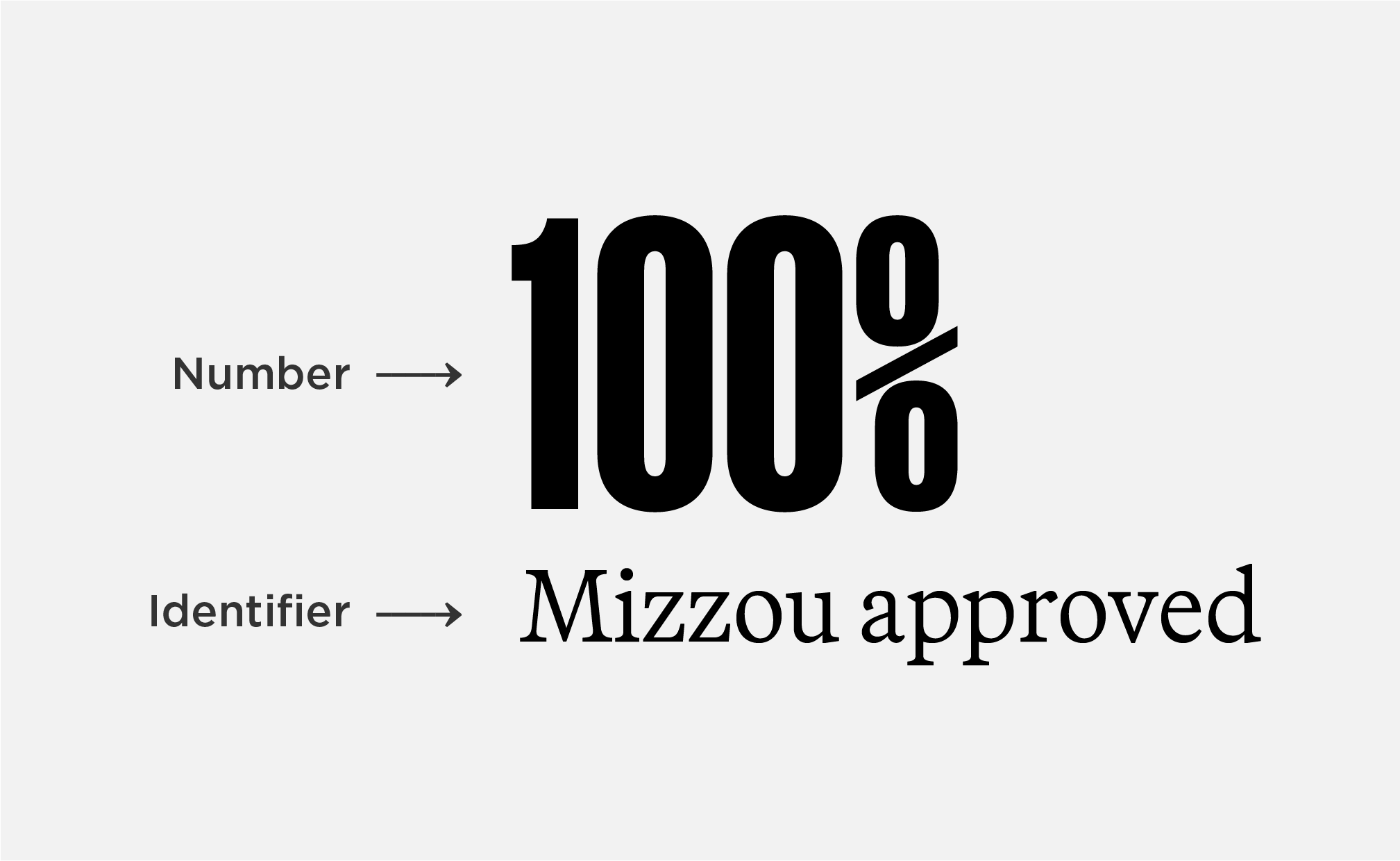
NUMBERS & IDENTIFIERS
Use Manuka for numbers. The identifier should be in Martina Plantijn, Social or Gotham, never Manuka.

ACCESSIBILITY | COLOR
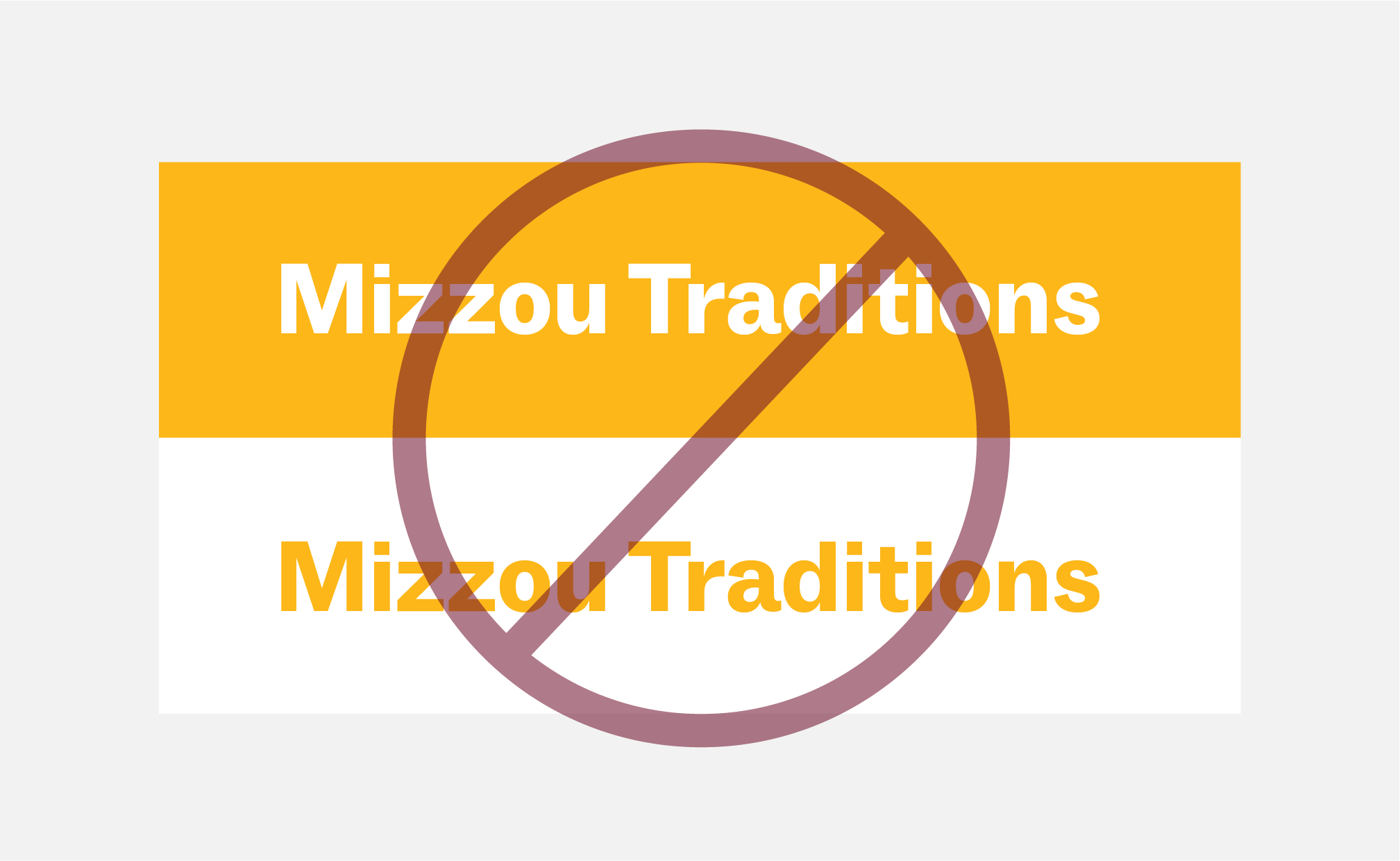
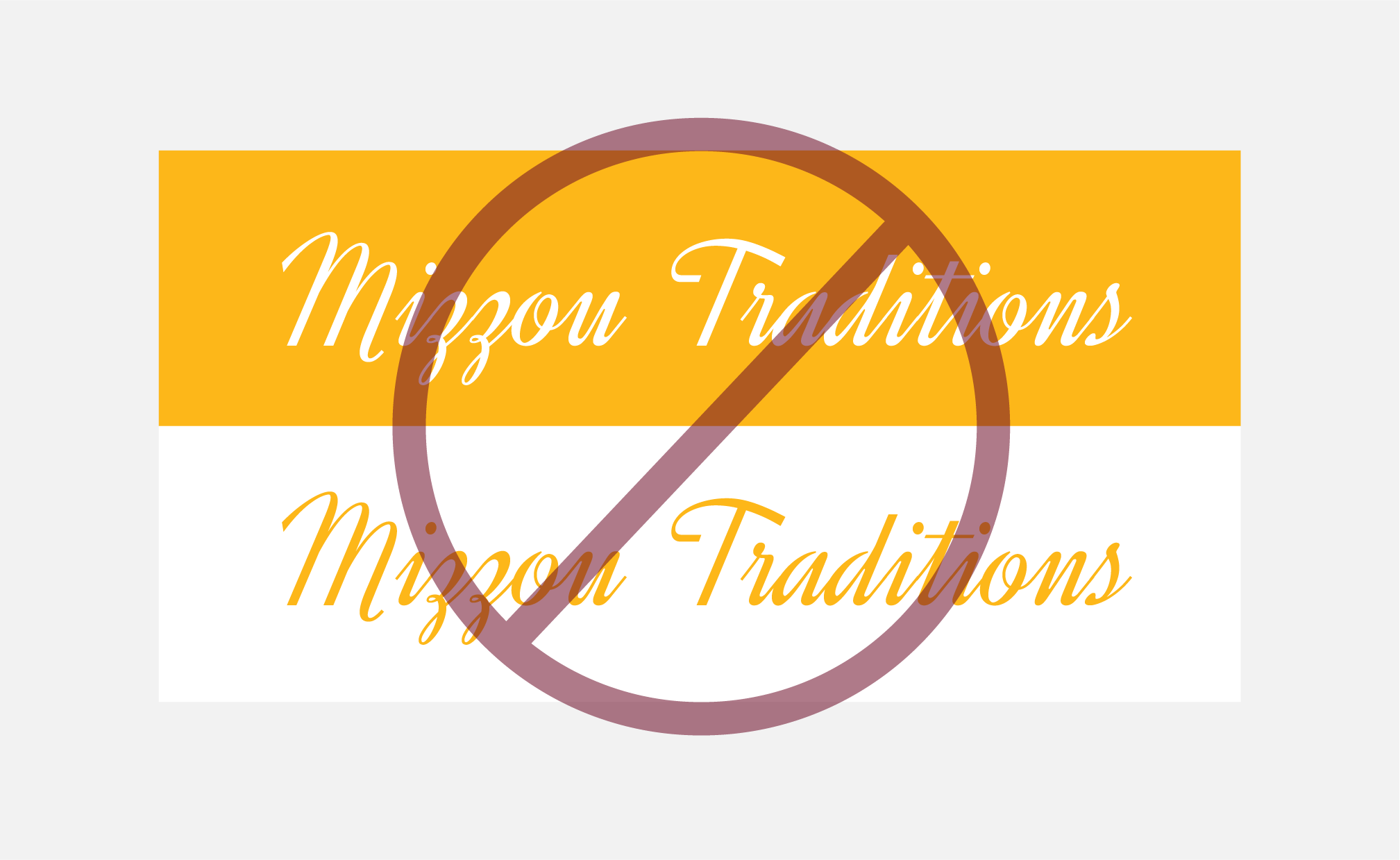
Do not use gold text on white backgrounds or white text on gold backgrounds.

ACCESSIBILITY | STROKES
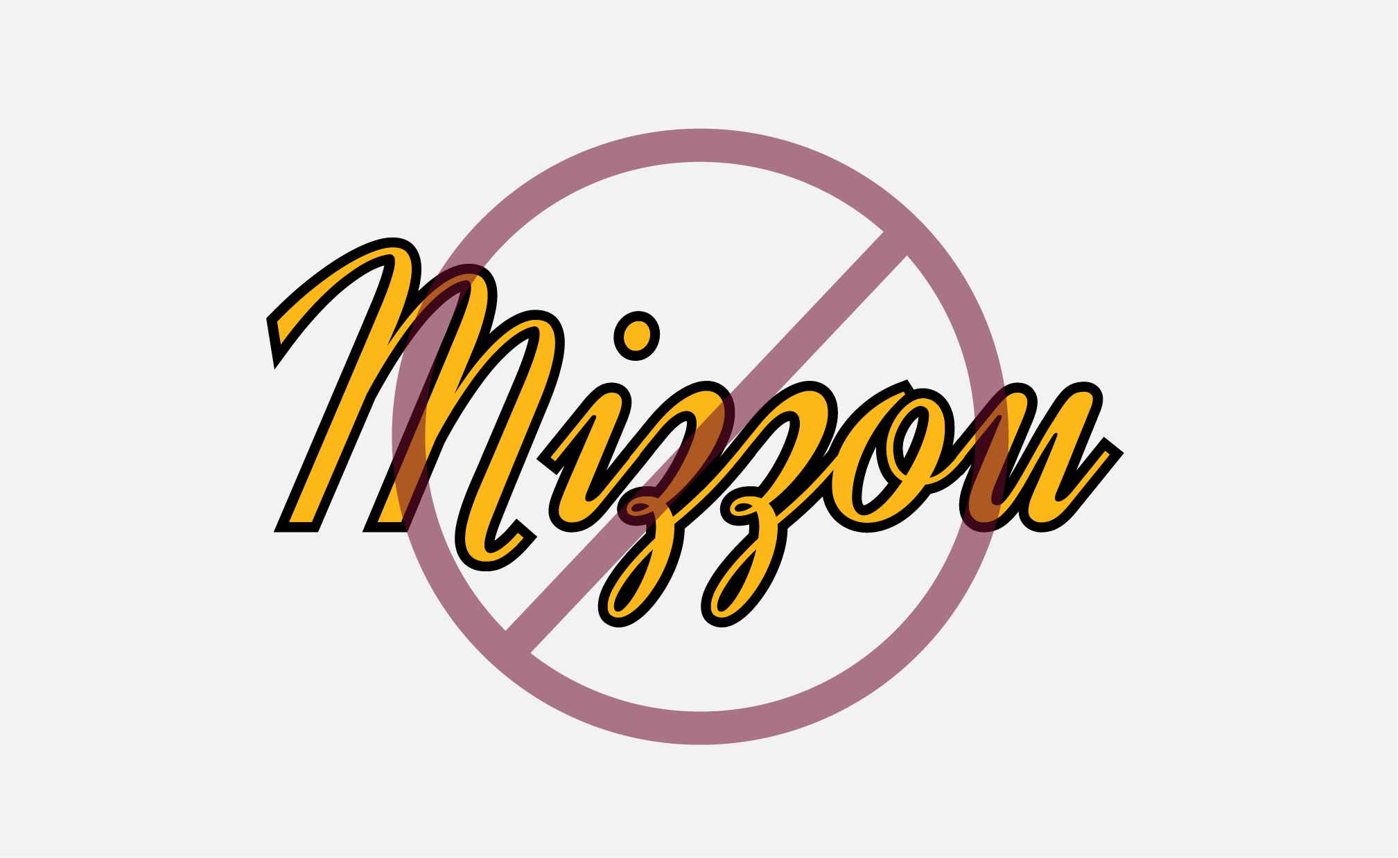
Do not add a stroke around Manuka in any color combination. Adding a stroke does not make text accessible.
Manuka Alternates
All guidelines and best practices for Manuka should be followed when using Morganite or Rama Gothic M.
Martina Plantijn
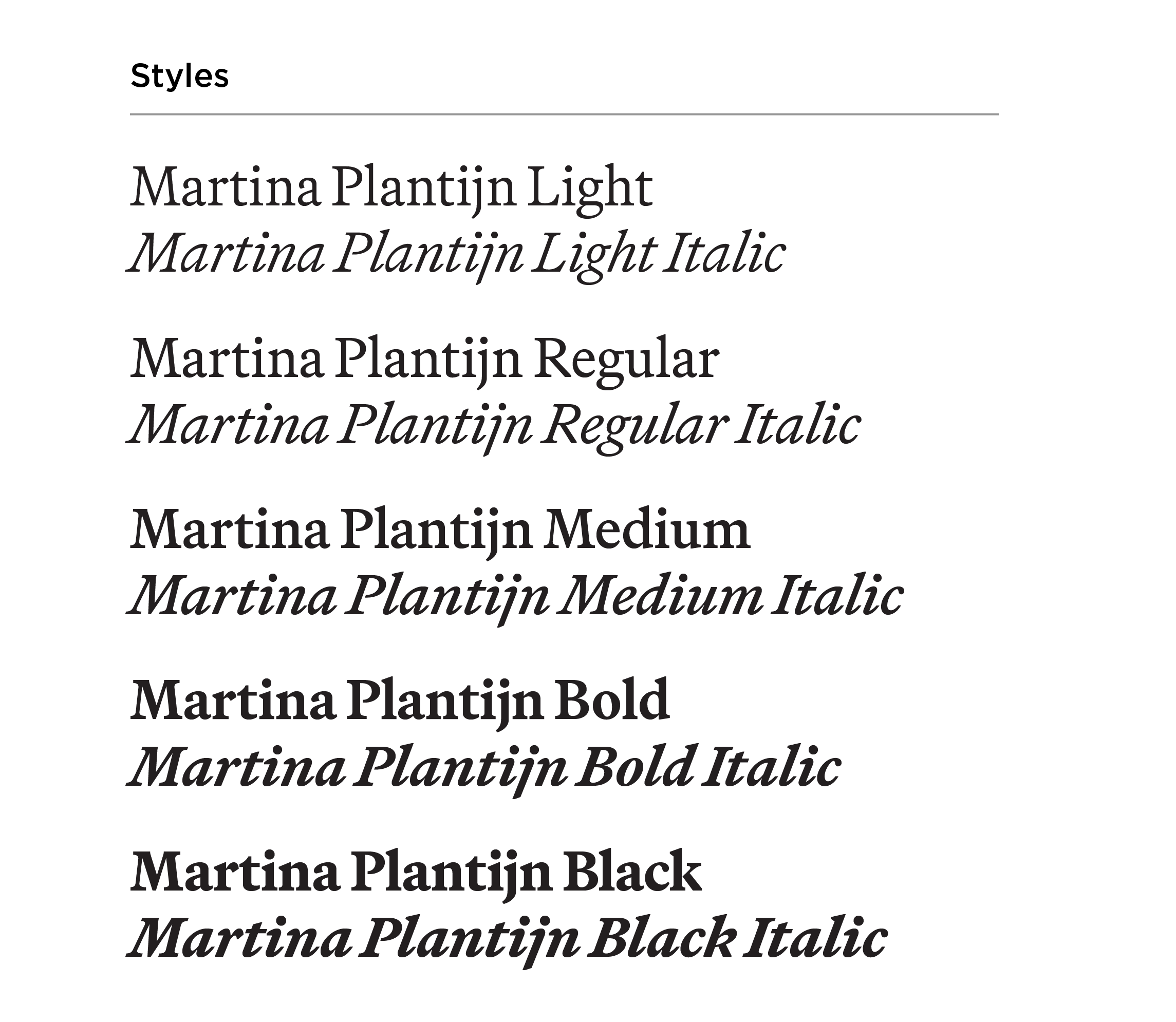
Martina Plantijn is a serif font with multiple weights that help create hierarchy and balance within layouts.
Approved alternates for Martina Plantijn:
- Font Set B: Guyot Text
- Font Set C: STIX Two Text
Use Martina Plantijn for:
- Headlines
- Subheads
- Body copy
- Pull quotes
- Captions
- Contact info
(URLs, phone numbers, email addresses)
Martina Plantijn Guidelines & Best Practices
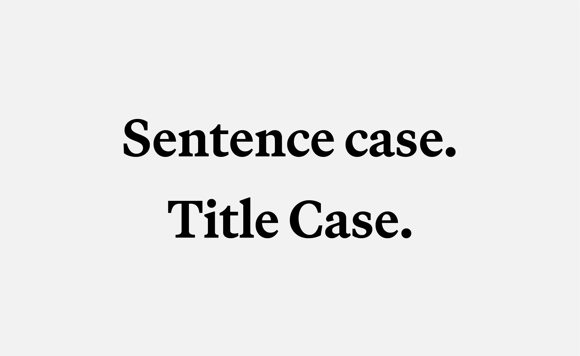
CASE
Use in sentence and title case. Use lowercase for URLs. Do not use Martina Plantijn in all caps.
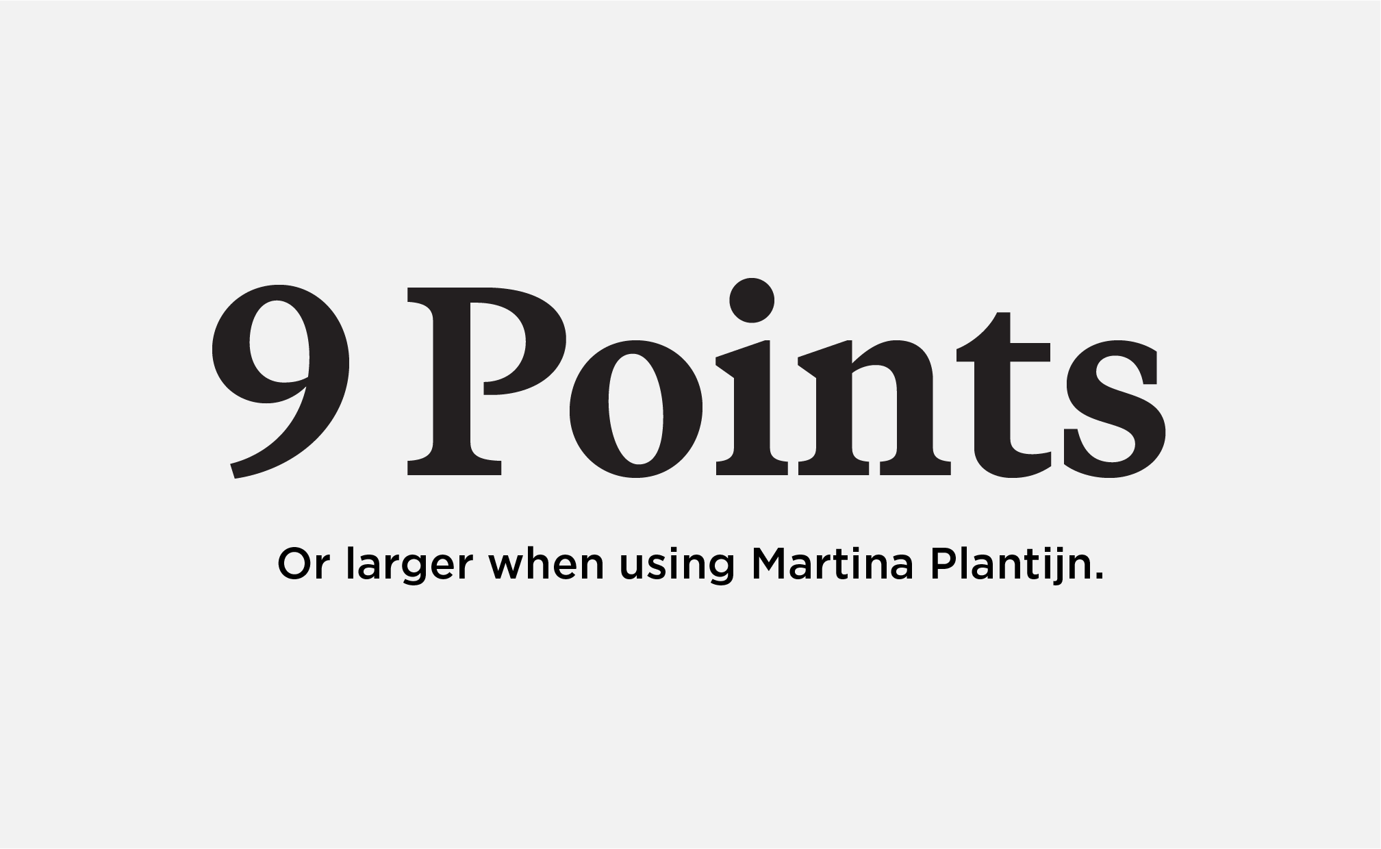
MINIMUM SIZE
Martina Plantijn should be 9 points or larger. Keep body copy between 9-11 pt.
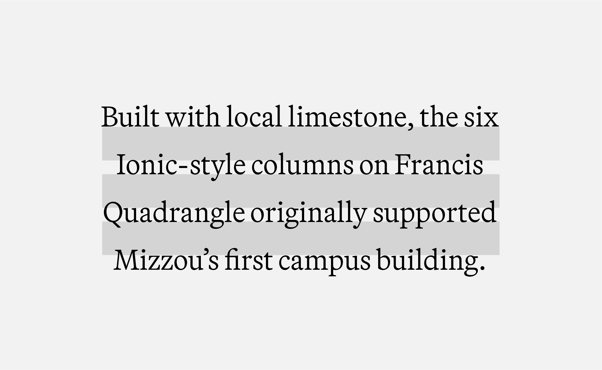
BODY COPY | LEADING
Leading should be 5 points more than the font size. For example, if the font is 11 pt, the leading should be 16 pt.
HEADER | LEADING
When using Martina Plantijn for headers, leading should be equal to the space between words.
ACCESSIBILITY | COLOR
Do not use gold text on white backgrounds or white text on gold backgrounds.

ACCESSIBILITY | STROKES
Do not add a stroke in any color combination. Adding a stroke does not make text accessible.
Martina Plantijn Alternates
All guidelines and best practices for Martina Plantijn should be followed when using STIX Two Text and Guyot Text.
ABC Social
ABC Social is a sans serif typeface with different weights that pairs well with Manuka and Martina Plantijn. Do not pair ABC Social with Gotham.
Approved alternates for ABC Social:
- Font Set B: Balto
- Font Set C: Satoshi
Use ABC Social for:
- Subheads
- Body copy
- Pull quotes
- Captions
- Contact info
(URLs, phone numbers, email addresses)
Do not use ABC Social for:
- Mastheads
- Headers
ABC Social Guidelines & Best Practices
CASE
ABC Social may be used in all caps, sentence case or title case. Do not typeset multiple sentences or body copy in all caps.
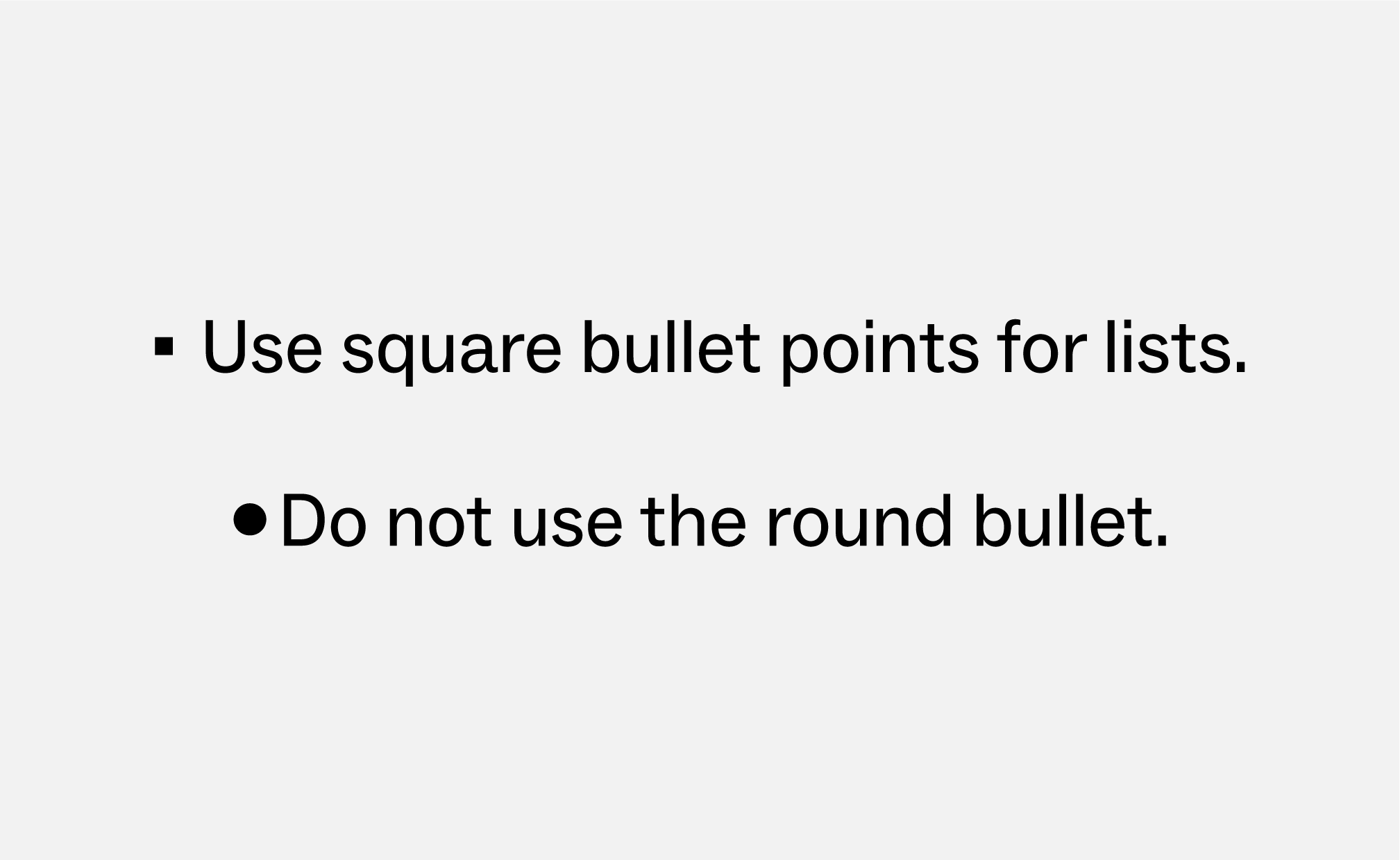
BODY COPY | BULLETS
Bulleted lists in ABC Social should use the square bullet point. Do not use round bullet points.
BODY COPY
Keep body copy between 9 pt and 11 pt. Leading should be 3 points or more than the font size. For example, if the font size is 11 pt, the leading should be 14 pt.

FOOTER URLs
Footer URLs should be styled as: ABC Social Bold, all caps, 12 pt font size and tracking set to 35.
ACCESSIBILITY | COLOR
Do not use gold text on white backgrounds or white text on gold backgrounds.

ACCESSIBILITY | STROKES
Do not add a stroke around ABC Social in any color combination. Adding a stroke does not make text accessible.
ABC Social Alternates
All guidelines and best practices for ABC Social should be followed when using Satoshi and Balto.
Gotham
Gotham is a sans serif typeface that pairs well with Manuka and Martina Plantijn and may be used in place of ABC Social for non-undergraduate audiences.
Gotham is also used for wayfinding, signage and environmental branding.
Approved alternates for Gotham:
- Font Set C: Montserrat
- When Montserrat is unavailable, Avenir Next LT Pro may be used.
Use Gotham for:
- Headers
- Subheads
- Body copy
- Pull quotes
- Captions
- Contact info
(URLs, phone numbers, email addresses)
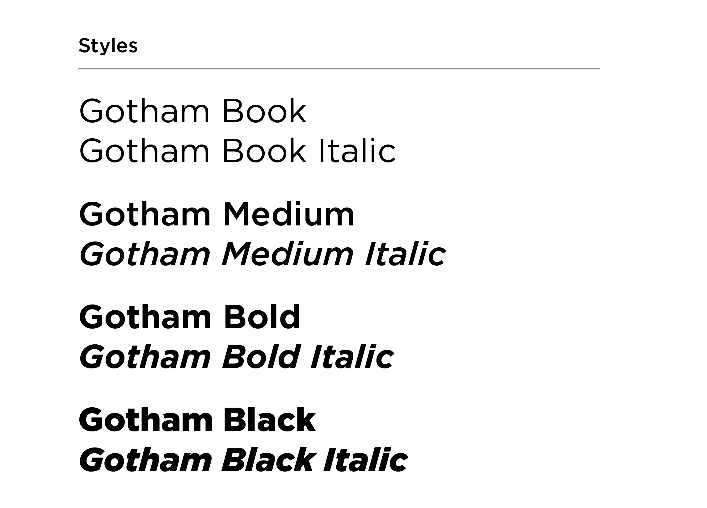
Gotham Guidelines & Best Practices
BODY COPY
Font size should be between 9 pt and 11 pt. Adjust leading to be 3 or more points than the font size.
CASE
Do not use Gotham in all caps for multiple sentences or body copy.

FOOTER URLs
Footer URLs should be styled as: Gotham Bold, all caps, 12 pt font size and tracking set to 35.
FONT PAIRINGS
Do not pair Gotham with Manuka Black or ABC Social. It may be paired with Manuka (bold, medium and regular) and Martina Plantijn (all weights).

ACCESSIBILITY | COLOR
Do not use gold text on white backgrounds or white text on gold backgrounds.

ACCESSIBILITY | STROKES
Do not add a stroke around Gotham in any color combination. Adding a stroke does not make text accessible.
Gotham Alternate
All guidelines and best practices for Gotham should be followed when using Montserrat or Avenir Next LT Pro.
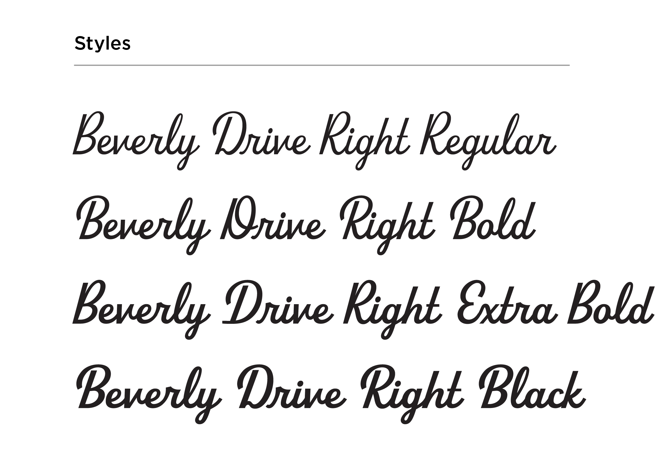
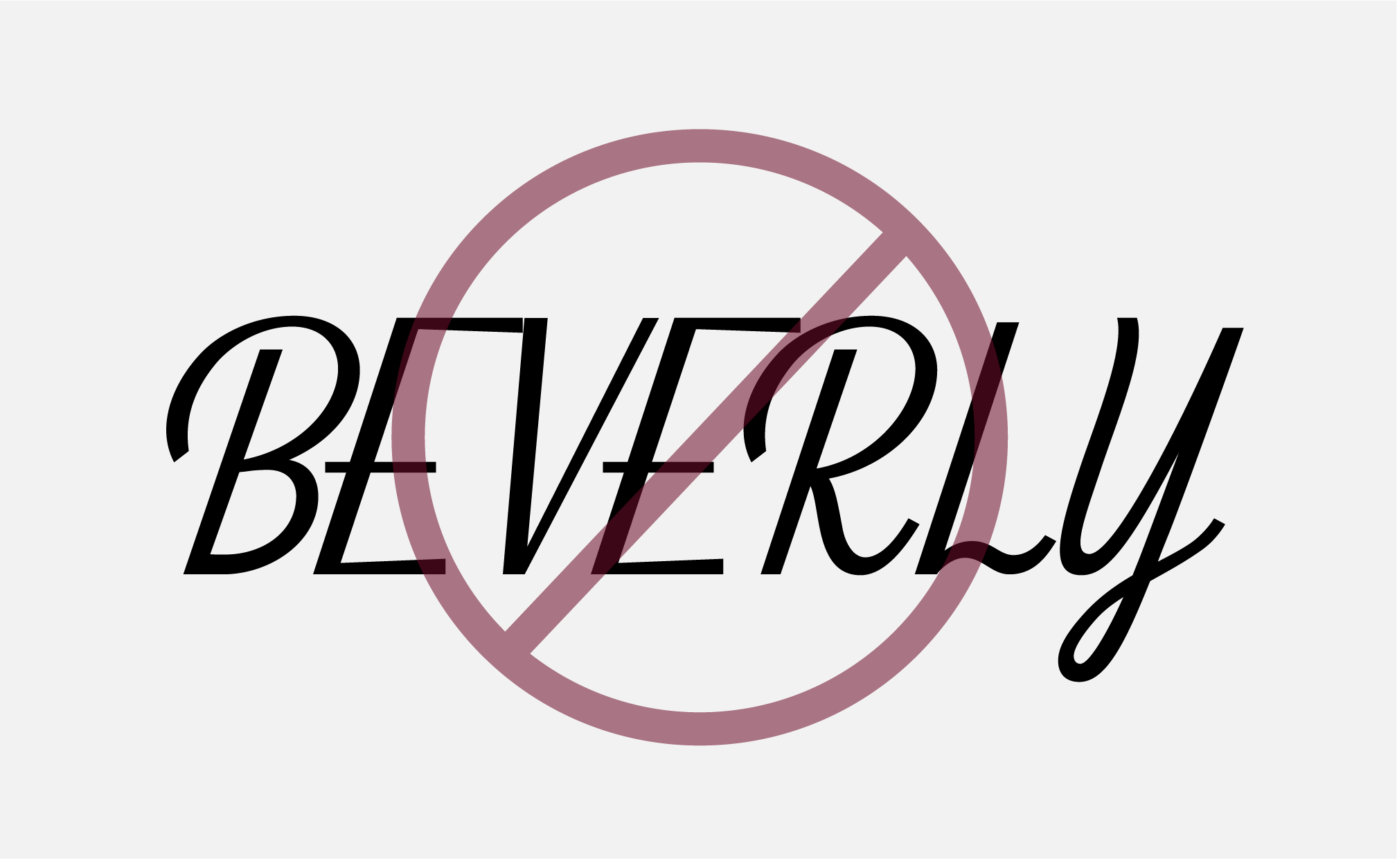
Beverly Drive Right
This font pairs well with Manuka and includes stylistic alternates.
While it is included in font set A and B, this font does require an Adobe license.
Approved alternates for Beverly Drive Right:
- There are no alternates for Beverly Drive Right. If you do not have an Adobe CC or Adobe Express license, typeset verbiage is availabe in the PowerPoint toolkit.
Use Beverly Drive Right for:
- Headlines
- Subheads
- Pull quotes
Do not use Beverly Drive Right for:
- Body copy
- Captions
- Contact information
(URLs, phone numbers, email addresses)
Beverly Drive Right Guidelines & Best Practices
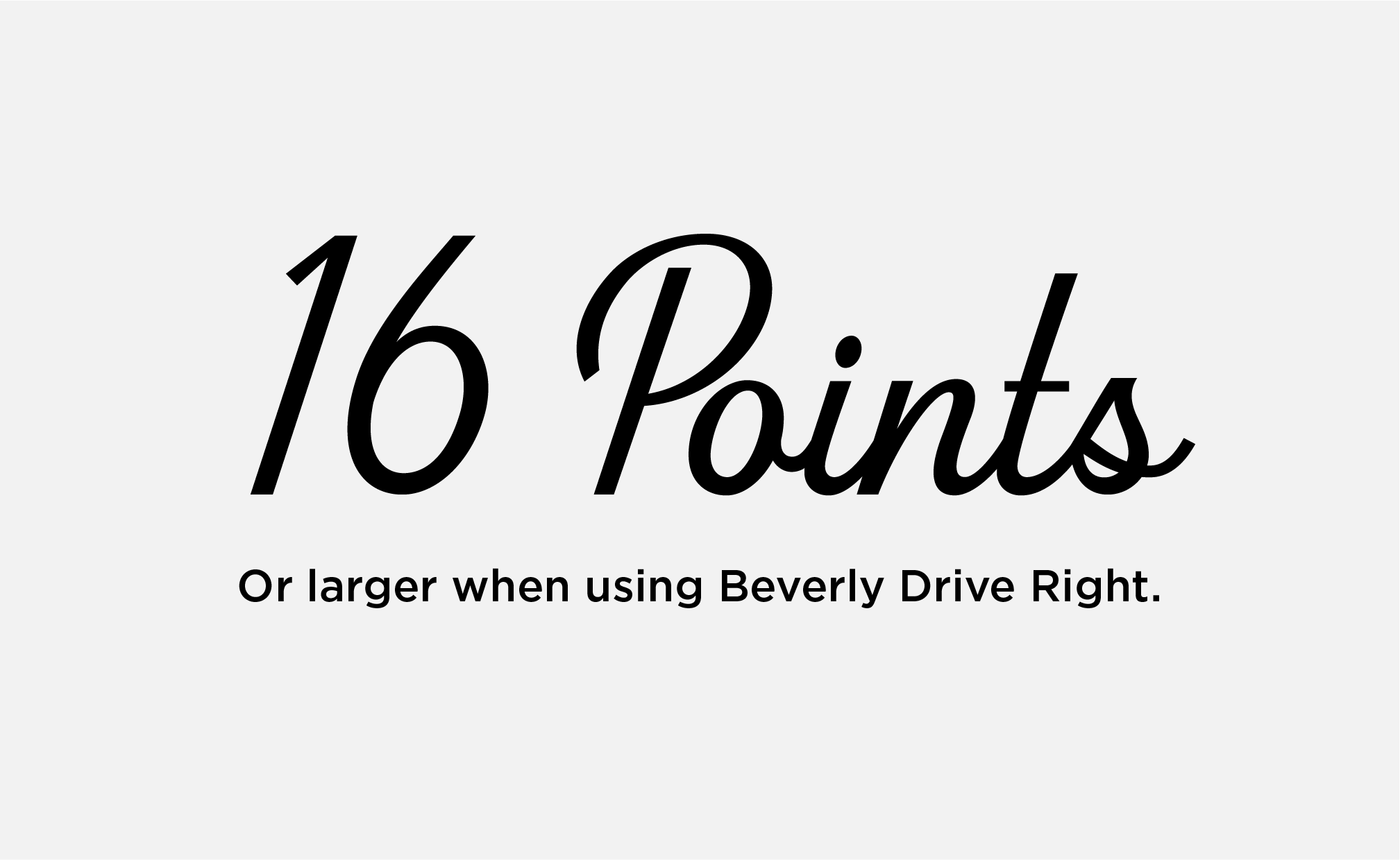
MINIMUM SIZE
Keep Beverly Drive Right at or above 16 points for legibility. Do not use below this point size.
CASE
Beverly Drive Right may be used in title or sentence case. Do not use in all caps.

ACCESSIBILITY | COLOR
Do not use gold text on white backgrounds or white text on gold backgrounds.
ACCESSIBILITY | STROKES
Do not add a stroke around Beverly Drive Right in any color combination. Adding a stroke does not make text accessible.
Beverly Drive Right Alternate
There is no alternate font for Beverly Drive Right. If users do not have an Adobe CC or Adobe Express license, approved typeset wordmarks are available as graphics in the Mizzou Brand Toolkit.
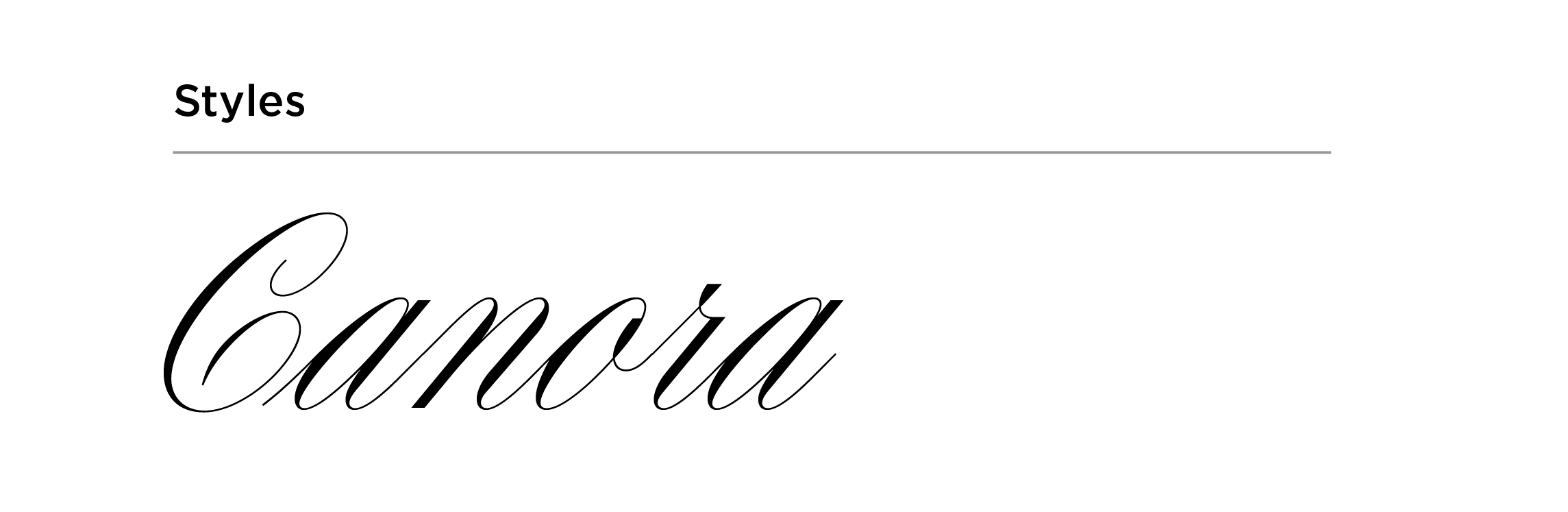
Canora
Canora is a formal script font that may be used for high-level event materials. Do not use Canora for semiformal events or in day-to-day marketing materials.
Use Canora for:
- Headers
- Subheads
Do not use Canora for:
- Mastheads
- Body copy
- Pull quotes
- Captions
- Contact info
(URLs, phone numbers, email addresses)
Canora Guidelines & Best Practices
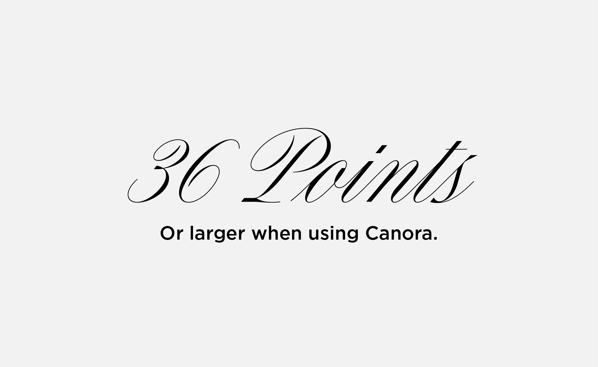
MINIMUM SIZE
Keep Canora at or above 36 pt for legibility. Do not use Canora below this point size.
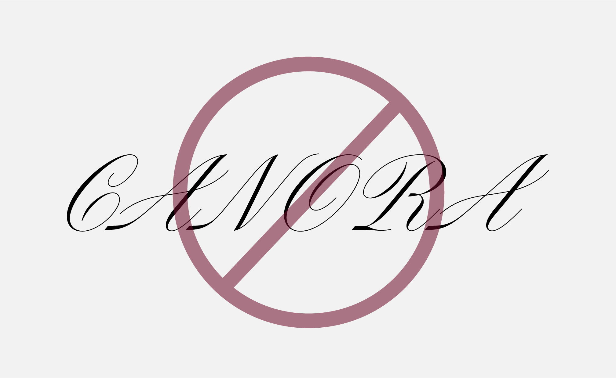
CASE
Canora may be used in title or sentence case. Do not use Canora in all caps.
ACCESSIBILITY | COLOR
Do not use gold text on white backgrounds or white text on gold backgrounds.
ACCESSIBILITY | STROKES
Do not add a stroke around Canora in any color combination. Adding a stroke does not make text accessible.
Canora Alternate
There is no alternate font for Canora. If licenses are not available, approved verbiage typeset in Canora are available as graphics in the Mizzou Brand Toolkit.
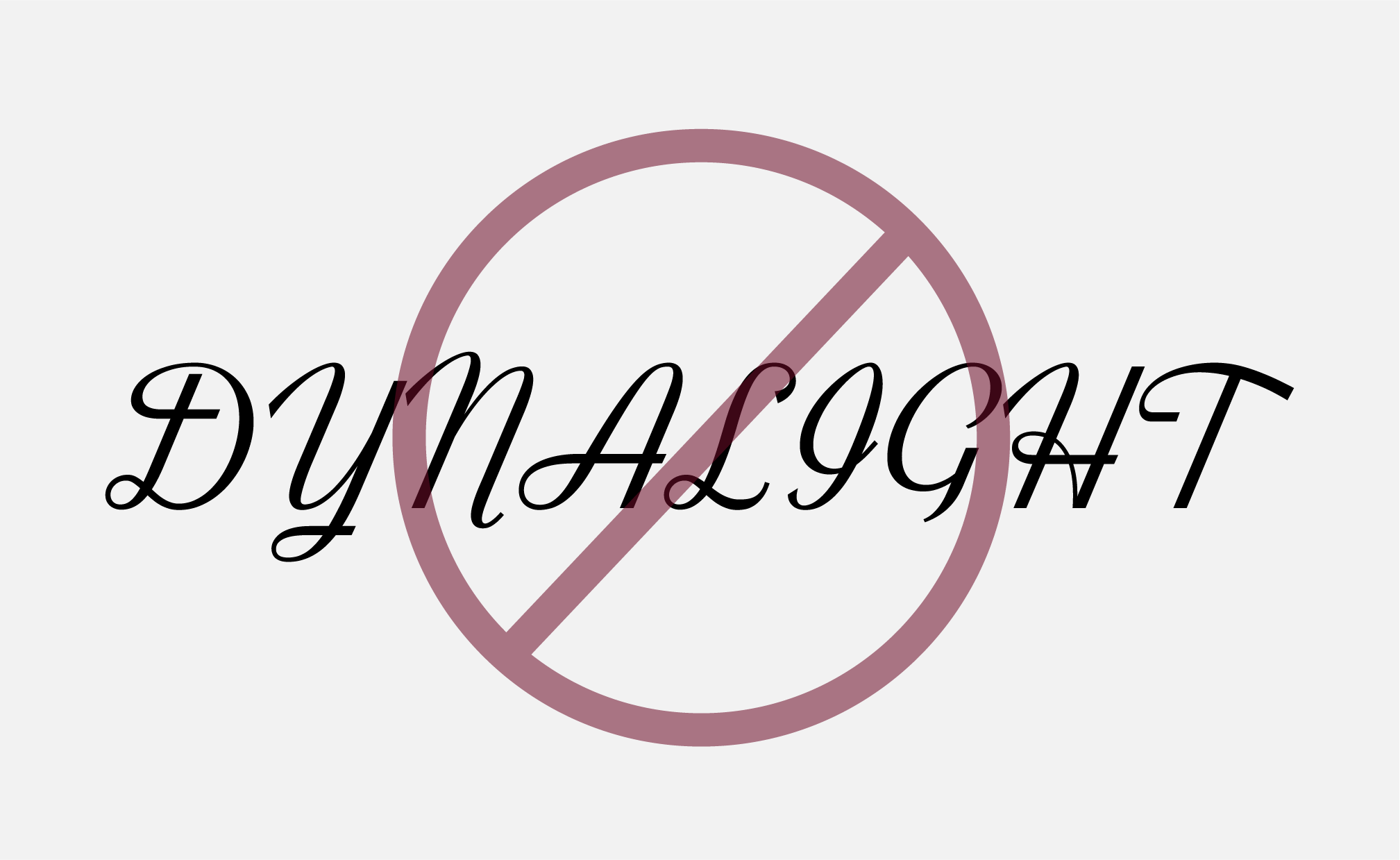
Dynalight
Dynalight is a script font that may be used for semiformal events, celebrations and other marketing materials where a script font is needed.
Use Dynalight for:
- Headers
- Subheads
Do not use Dynalight for:
- Mastheads
- Body copy
- Pull quotes
- Captions
- Contact info
(URLs, phone numbers, email addresses)
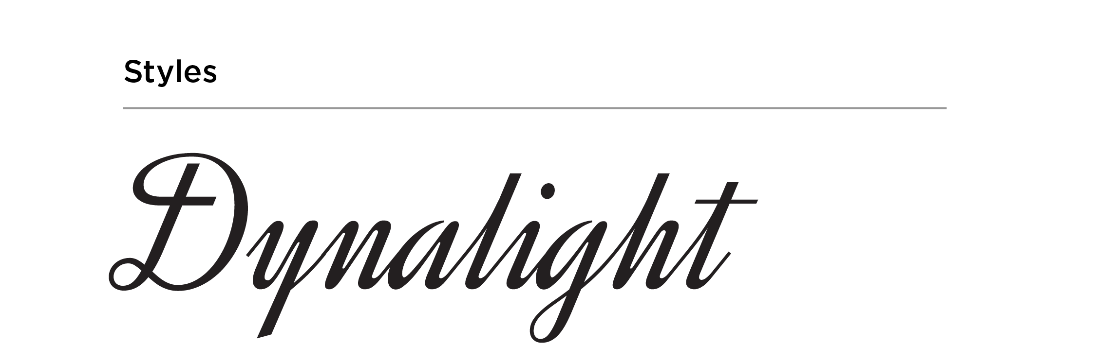
Dynalight Guidelines & Best Practices
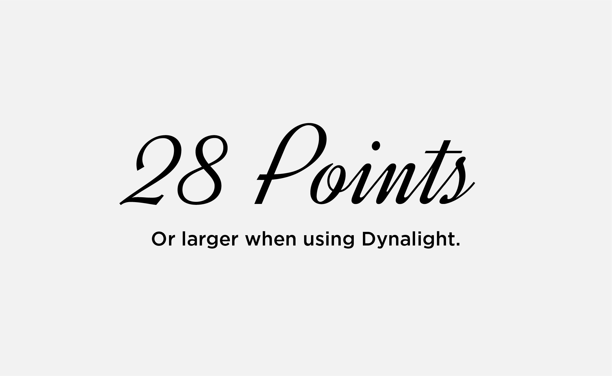
MINIMUM SIZE
Keep Dynalight at or above 28 pt for legibility. Do not use Dynalight below this point size.
CASE
Dynalight may be used in title or sentence case. Do not use Dynalight in all caps.
ACCESSIBILITY | COLOR
Do not use gold text on white backgrounds or white text on gold backgrounds.
ACCESSIBILITY | STROKES
Do not add a stroke around Dynalight in any color combination. Adding a stroke does not make text accessible.
Dynalight Alternate
Dynalight is a free font that is available on your university-provided device.
Font Pairings by Audience
Mizzou’s brand typefaces are versatile, allowing us to use different combinations to make designs feel more formal or more casual. These recommended font pairings will help you adjust the visual tone of your message to specific audiences. If you have questions about using brand typefaces, please email brand@missouri.edu.
Jump to:
Prospective Students (Undergraduate and General) | Prospective Students (Graduate, Online Learners, Honors) | Current Mizzou Community | External Audiences | High-Level Events and Celebrations
Prospective Students | Current Students
Audience Guidelines & Best Practices
- May use Manuka Black or Bold for headlines in all caps.
- May use Martina Plantijn Bold for headlines in title or sentence case.
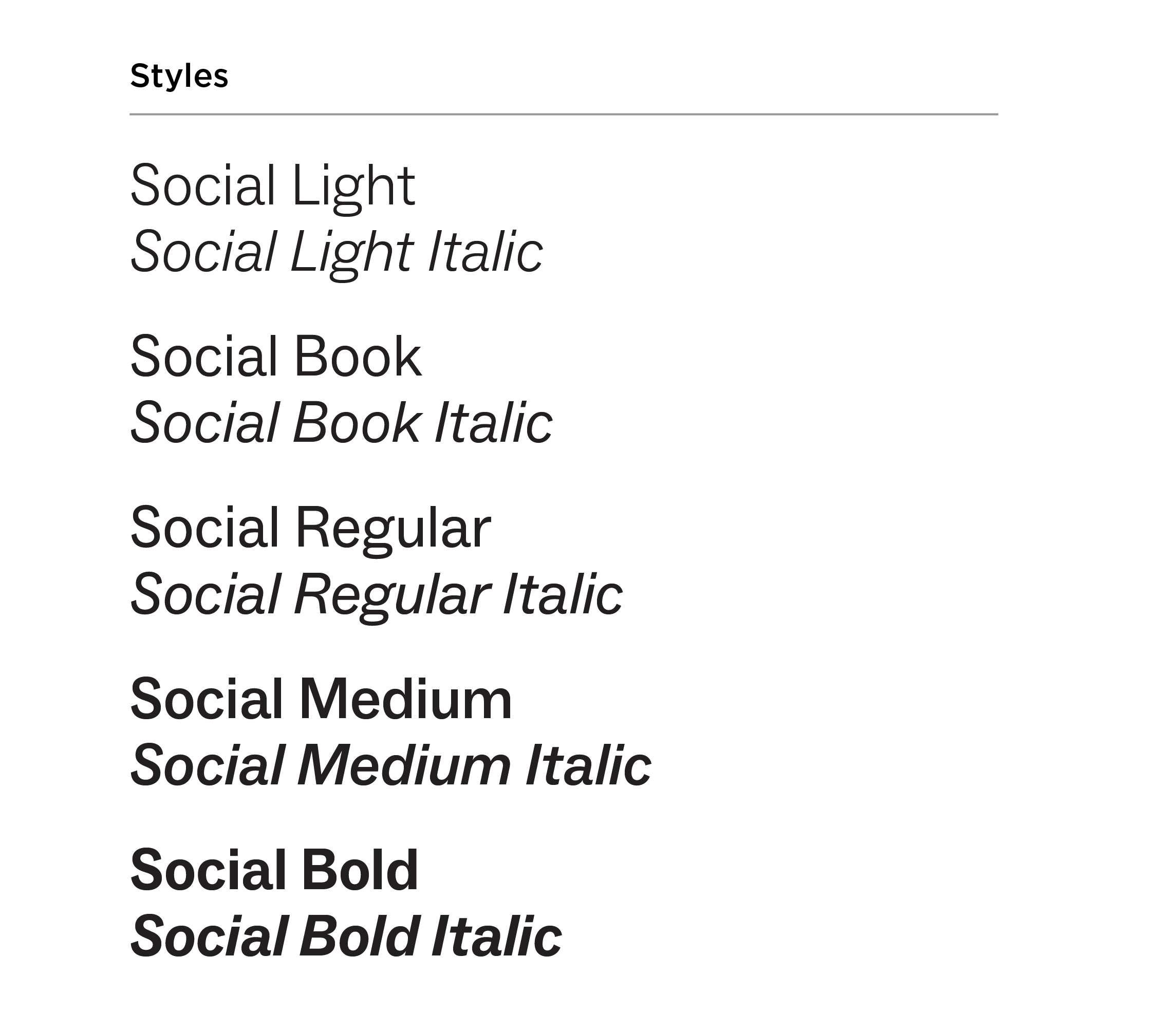
- Use Martina Plantijn Regular or Social Bold for subheads.
- Use Social Regular or Martina Plantijn Regular for body copy.
- Do not use Gotham.
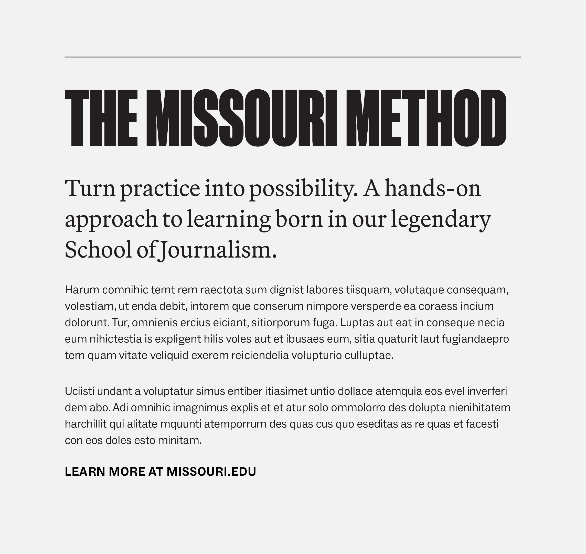
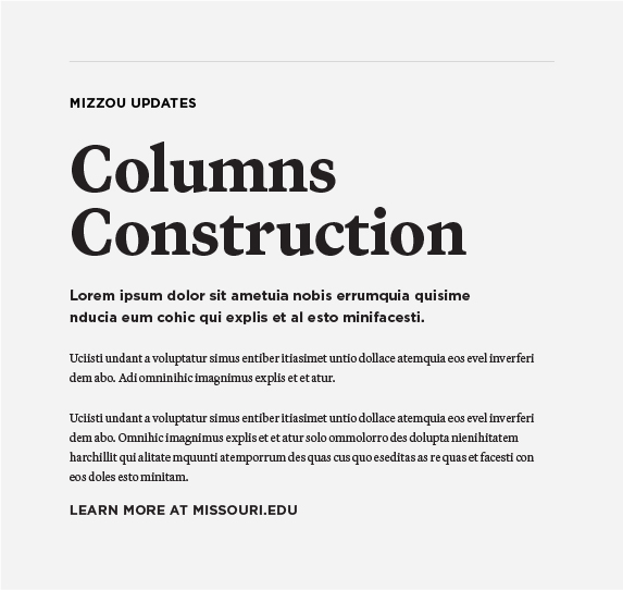
EXAMPLE 1
Headline: Manuka Black, all caps
Subhead: Martina P. Regular, 23 pt font, 20 pt leading
Body copy: Social Regular, 11 pt font, 16 pt leading
CTA: Social Bold, all caps, 12 pt font, 35 pt tracking
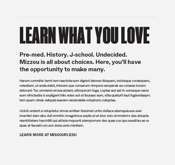
EXAMPLE 2
Headline: Manuka Black, all caps
Subhead: Social Bold, 20 pt font, 27 pt leading
Body copy: Social Regular, 11 pt font, 16 pt leading
CTA: Social Bold, all caps, 12 pt font, 35 pt tracking

EXAMPLE 3
Headline: Manuka Bold, all caps
Subhead: Social Bold, 2 pt font, 27 pt leading
Body copy: Martina Plantijn, 11 pt font, 17 pt leading
CTA: Social Bold, all caps, 12 pt font, 35 pt tracking
EXAMPLE 4
Headline: Martina Plantijn, 60 pt font, 68 pt leading
Subhead: Martina P. Regular, 23 pt font, 20 pt leading
Body copy: Social Regular, 11 pt font, 16 pt leading
CTA: Social Bold, all caps, 12 pt font, 35 pt tracking
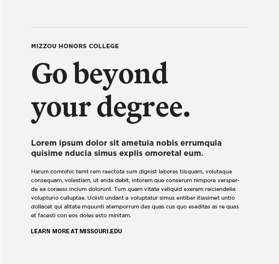
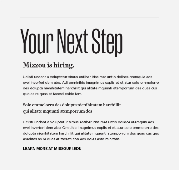
Prospective Students | Graduate, Online, Honors
Audience Guidelines & Best Practices
- May use Manuka Bold or Medium for headlines in all caps. Do not use Manuka Black.
- May use Martina Plantijn Bold for headlines in title or sentence case.
- Use Martina Plantijn, Social or Gotham for subheads.
- Use Social Regular, Gotham Book or Martina Plantijn Regular for body copy.
EXAMPLE 1
Headline: Manuka Bold, all caps
Subhead: Martina P. Bold, 16 pt font, 21 pt leading
Body copy: Gotham Book, 11 pt font, 18 pt leading
CTA: Gotham Bold, all caps, 12 pt font, 35 pt tracking

EXAMPLE 2
Headline: Manuka Medium, all caps
Subhead: Martina P. Light, 16 pt font, 21 pt leading
Body copy: Gotham Book, 11 pt font, 18 pt leading
CTA: Gotham Bold, all caps, 12 pt font, 35 pt tracking

EXAMPLE 3
Headline: Manuka Medium, all caps, 95 pt font
Subhead: Social Medium, 21 pt font, 29 pt leading
Body copy: Social Regular, 11 pt font, 17 pt leading
CTA: Social Bold, all caps, 12 pt font, 35 pt tracking

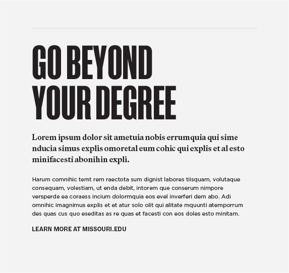
EXAMPLE 4
Headline: Martina Plantijn Bold, 60 pt font, 68 pt leading
Subhead: Gotham Bold, 16 pt font, 21 pt leading
Body copy: Gotham Book, 11 pt font, 18 pt leading
CTA: Gotham Bold, all caps, 12 pt font, 35 pt tracking
Current Mizzou Community | Faculty and Staff
Audience Guidelines & Best Practices
- May use Manuka Medium or Regular for headlines in all caps or title case.
- May use Martina Plantijn Bold or Black for headlines in title or sentence case.
- Use Martina Plantijn, Social or Gotham for subheads.
- Use Social Regular, Gotham Book, or Martina Plantijn Regular for body copy.
- Include at least two brand fonts. Do not use only one font.

EXAMPLE 1
Headline: Martina P. Bold, 60 pt font, 65 pt leading
Subhead: Gotham Bold, 13 pt font, 19 pt leading
Body copy: Gotham Book, 11 pt font, 18 pt leading
CTA: Gotham Bold, all caps, 12 pt font, 35 pt tracking
EXAMPLE 2
Headline: Martina P. Black, 60 pt font, 58 pt leading
Subhead: Gotham Bold, 13 pt font, 19 pt leading
Body copy: Gotham Book, 11 pt font, 18 pt leading
CTA: Gotham Bold, all caps, 12 pt font, 35 pt tracking

EXAMPLE 3
Headline: Manuka Regular, 86 pt font, 78 pt leading
Subhead: Martina Plantijn, 22 pt font
Body copy: Gotham Book, 11 pt font, 18 pt leading
CTA: Gotham Bold, all caps, 12 pt font, 35 pt tracking
EXAMPLE 4
Headline: Manuka Regular, 106 pt font
Subhead: Martina Plantijn, 22 pt font
Body copy: Social Book, 11 pt font, 18 pt leading
CTA: Social Bold, all caps, 12 pt font, 35 pt tracking
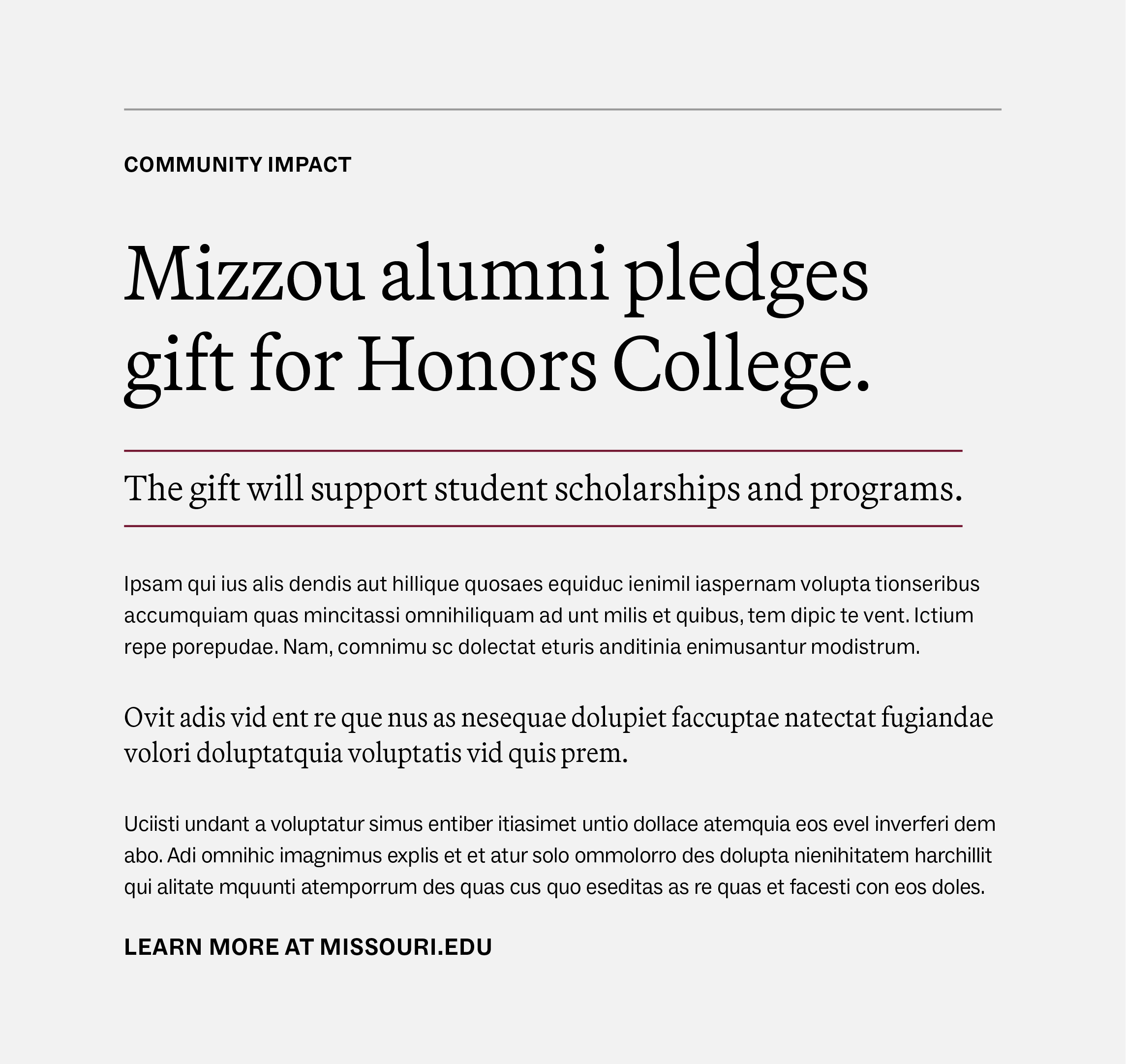
External Audiences
This audience includes alumni, potential donors, prospective faculty and staff, the media and the general public.
Audience Guidelines & Best Practices
- May use Manuka Medium or Regular for headlines in all-caps or title case. Do not use Manuka Black or Bold.
- May use Martina Plantijn Light, Medium or Bold for headlines in title or sentence case.
- Use Martina Plantijn, Social or Gotham for subheads.
- Use Social Regular, Gotham Book or Martina Plantijn Regular for body copy.
- Include at least two brand fonts. Do not use only one font.

EXAMPLE 1
Headline: Manuka Regular, title case
Subhead: Social Bold, 17 pt font, 60 tracking
Body copy: Martina P. Regular, 11 pt font, 16 pt leading
CTA: Social Bold, all caps, 12 pt font, 35 pt tracking

EXAMPLE 2
Headline: Martina Bold, 39 pt font, 45 pt leading
Subhead: Social Bold, 20 pt font
Body copy: Martina P. Regular, 11 pt font, 16 pt leading
CTA: Social Bold, all caps, 12 pt font, 35 pt tracking

EXAMPLE 3
Headline: Martina P. Medium, 39 pt font, 46 pt leading
Subhead: Martina P. Light, 22 pt font
Body copy: Gotham Book, 11 pt font, 18 pt leading
Pullquote: Martina P. Medium Italic, 14 pt font, 20 pt leading
CTA: Gotham Bold, all caps, 12 pt font, 35 pt tracking
EXAMPLE 4
Headline: Martina P. Light, 39 pt font, 46 pt leading
Subhead: Martina P. Light, 18 pt font
Body copy: Social Regular, 11 pt font, 18 pt leading
Pullquote: Martina P. Medium, 14 pt font, 20 pt leading
CTA: Social Bold, all caps, 12 pt font, 35 pt tracking
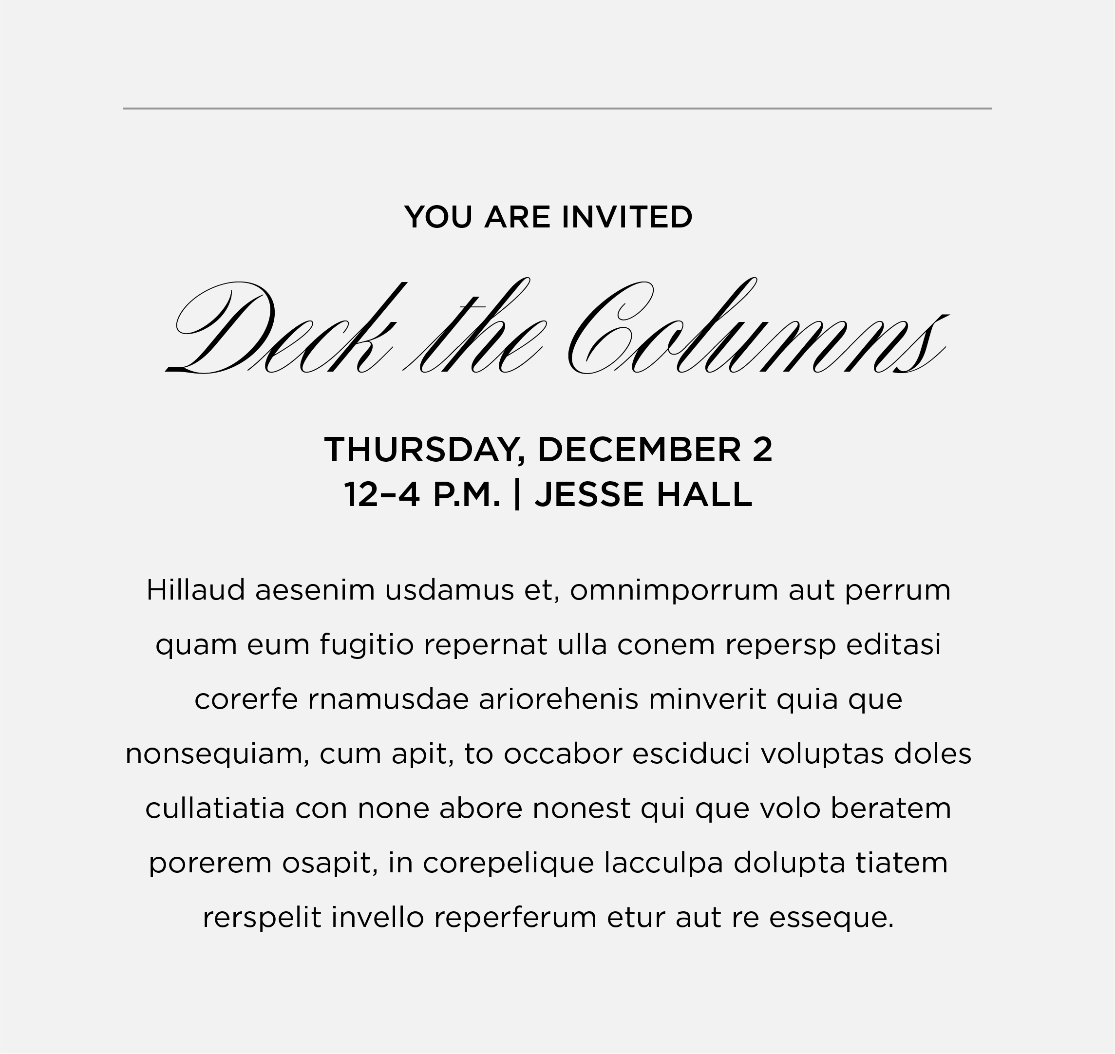
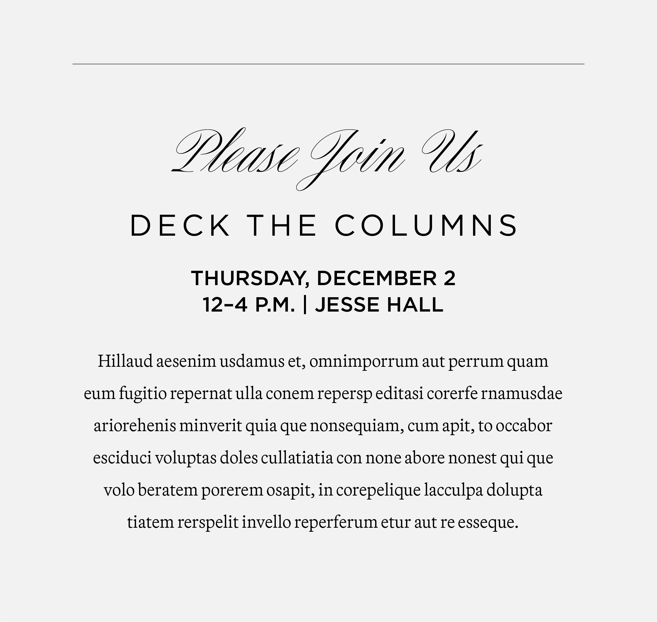
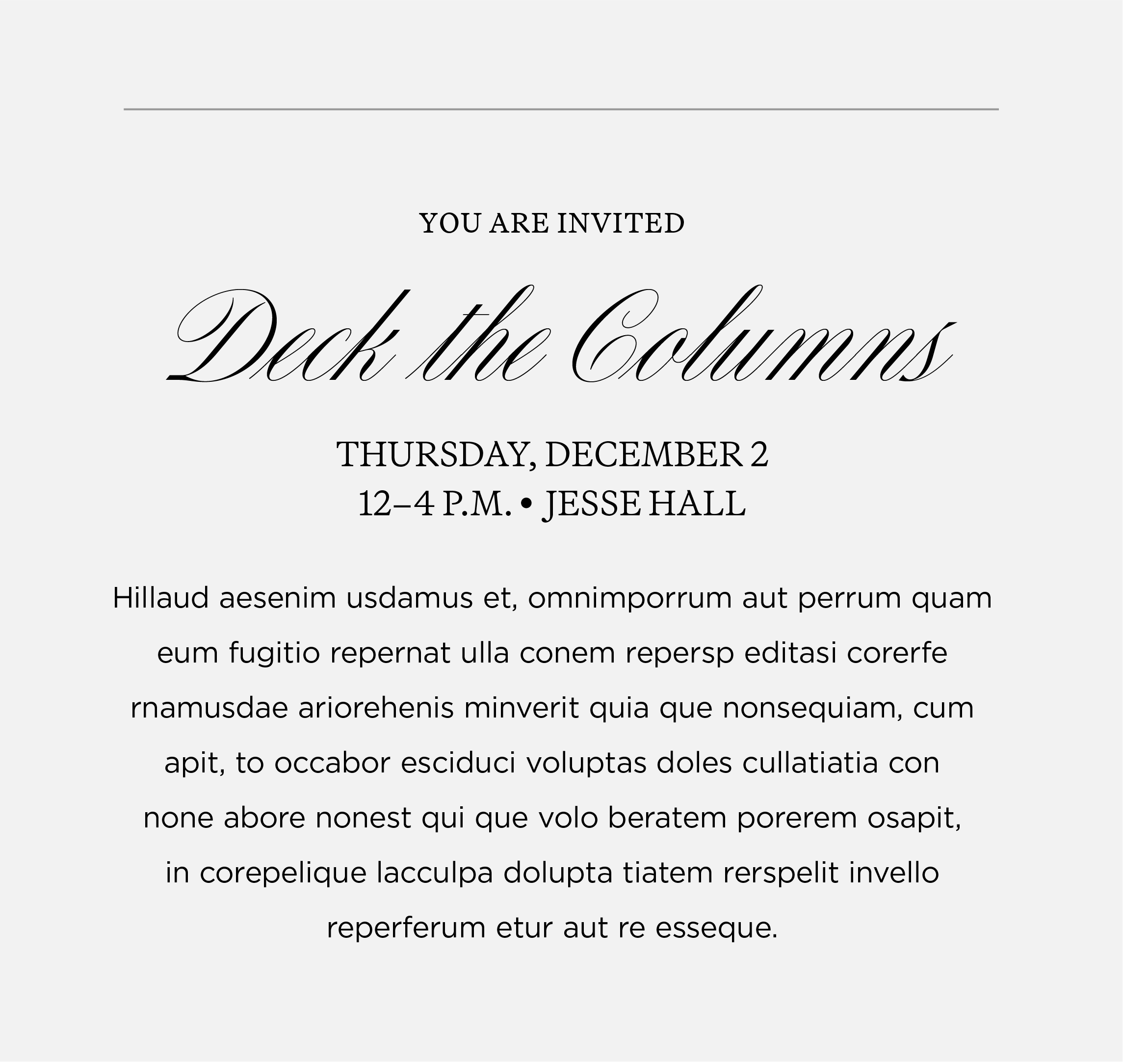
High-Level Events & Celebrations
These examples show the use of Canora to create elevated event materials and invitation.
Event Guidelines & Best Practices
- May use Canora for the event name or the extend invitation text.
- May use Martina Plantijn or Gotham for the event name or the extend invitation text.
- Use Martina Plantijn or Gotham for the date, time and location.
- Use Martina Plantijn or Gotham for the description or additional body copy.
- Do not use Manuka or Social with Canora.
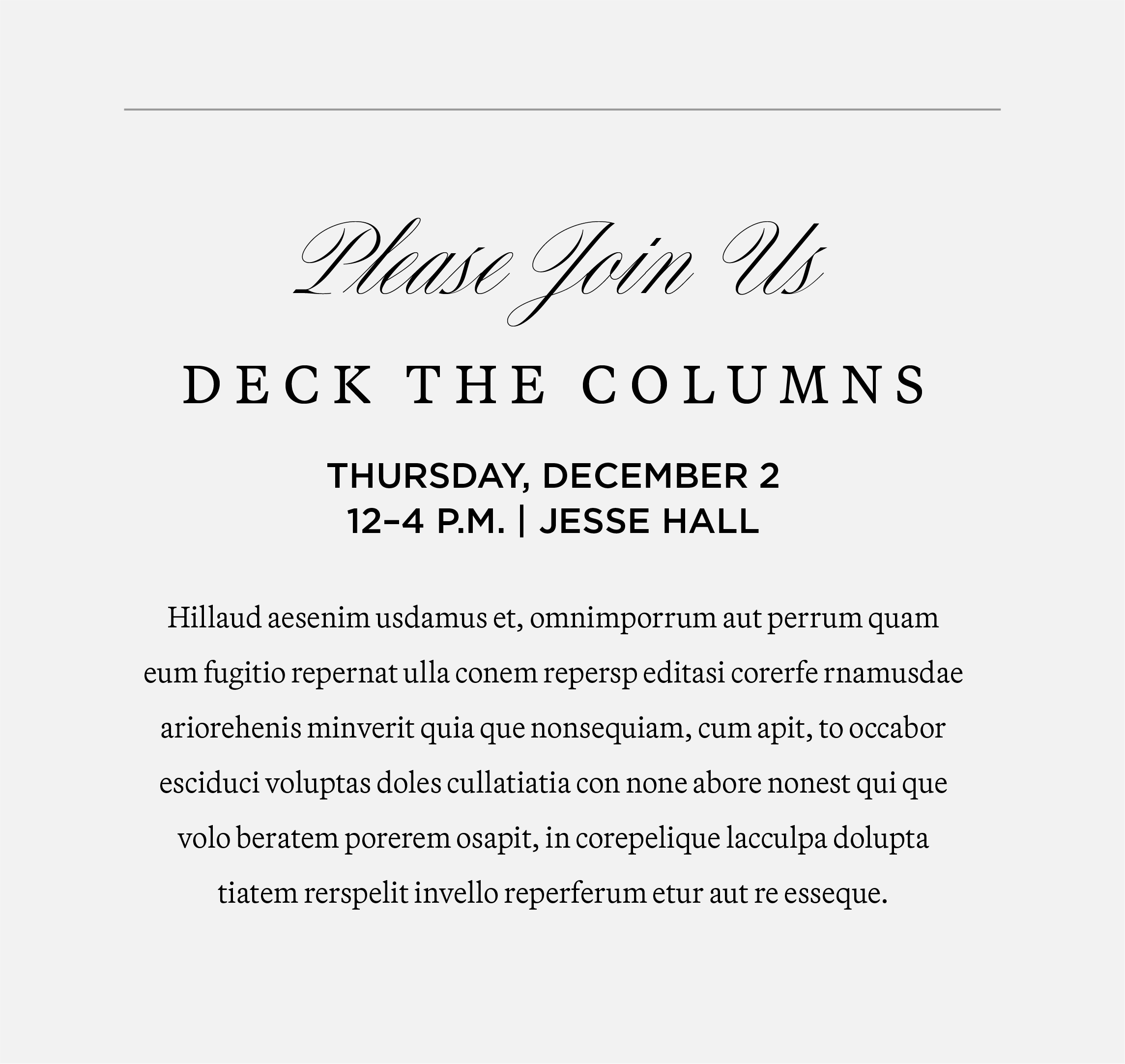
EXAMPLE 1
Extend Invitation: Canora
Event Name: Martina P. Light, small caps, 160 tracking
Date/Time/Location: Gotham Medium, all caps
Description: Martina P. Light, 9 pt font, 18 pt leading
EXAMPLE 2
Extend Invitation: Gotham Medium, all caps
Event Name: Canora
Date/Time/Location: Gotham Medium, all caps
Description: Gotham Book, 9 pt font, 18 pt leading
EXAMPLE 3
Extend Invitation: Canora
Event Name: Gotham Book, all caps, 100 tracking
Date/Time/Location: Gotham Medium, all caps
Description: Martina P. Light, 9 pt font, 18 pt leading
EXAMPLE 4
Extend Invitation: Martina Plantijn Light, small caps
Event Name: Canora
Date/Time/Location: Martina P. Light, small caps
Description: Gotham Book, 9 pt font, 18 pt leading
Signature and Evergreen Fonts
These fonts are used by Licensing & Brand Management to maintain Mizzou’s signature policy.
Janson
Janson is reserved for university signatures and stationery items. It should no longer be used in any other capacity.
Gotham
Gotham is used by Licensing & Brand Management to create official lockups such as multi-unit signatures and social avatars. Gotham is also used for environmental branding, signage and wayfinding.
If you have questions, please email brand@missouri.edu
Website Fonts
The following fonts are used by Digital Service and approved third-party vendors to maintain Mizzou’s brand. All missouri.edu sites on the Digital Service brand template are covered under the web font license purchased by Licensing & Brand Management.
- Manuka Bold
- Martina Plantijn Bold
- Open Sans
If you have questions, please email brand@missouri.edu.